Money Flow Tracer
Trading Indicator Web App
Improving Trading Decisions & Alleviating Trading Anxiety Through QUnicorn's Money Flow Tracer.
Role
Product Designer
Client
Personal Project
Date
June 2021
Duration
4 Weeks (Design + Development)
Responsibilities
- Define the problem and figure out the product strategy
- Conduct user research (Survey and user interviews)
- Define user persona & Analyse user journey map
- Build Information Architecture & Wireframe
- UI Design
- Collaborating with developers
- Usability Test & Iteration
- Render Mockup Images
*Disclaimer: This UX case study is intended to demonstrate the design process, design skills, and overall outcomes. To safeguard the commercial confidentiality of the client company, certain contents have been modified, and they may vary from the released product.
Overview
In the realm of capital trading markets, many traders are familiar with fundamental and technical analysis. However, there exists an analytical approach referred to as capital flow analysis, which holds significant sway in daily trading endeavours. Money Flow stands as a direct catalyst, propelling stock prices upward or pulling them downward. While extensively utilized by perceptive professional traders, this method often eludes the awareness of non-professional individual traders.
Introduction
QUnicorn is an innovative fintech startup founded by former Wall St. traders and analysts. The company's mission is to create a Money Flow Tracer tailored for retail traders. This Money Flow Tracer is developed to track the path of 'smart money' from institutions on a daily basis through quant analysis, providing traders with a query tool to investigate the money flow patterns of their desired stocks or ETFs.
Having a trader background myself, I was invited to assist them in designing the user experience and user interface for their programming prototype.
RENDERED PRODUCT
PART 1. IDENTIFY THE PROBLEM
Problem
How to make better trade decisions with a higher win rate and less uncertainty?
1. Retail traders often feel anxious and tense when making trading decisions because they have to face the uncertainty and fluctuations of the market.
2. Many retail traders are only familiar with technical analysis and are unaware of the existence of money flow analysis methods. This necessitates a tool to assist them in learning and analyzing capital flow indicators.
Design Challenge
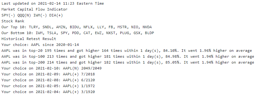
The current version of the money flow web app is only a plain text product prototype and does not include a user interface and user experience workflow. This makes it less user-friendly for retail traders to use this web app for analyzing stock money flow.
Goal
1. Design a whole new user interface for the product.
2. Create a seamless and efficient user experience for retail traders to use the money flow app
PART 2. USER RESEARCH
QUnicorn team has built a Discord server containing many initial Alpha test users. So we can directly communicate with these users to get some insights about their pain points and needs.
Target User
Retail Traders (most of them are non-professional and part-time traders)
Objectives
1. To gain insights into the thoughts and needs of retail traders during their stock trading activities.
2. To identify the pain points experienced when using the existing text-only money flow tracer web app.
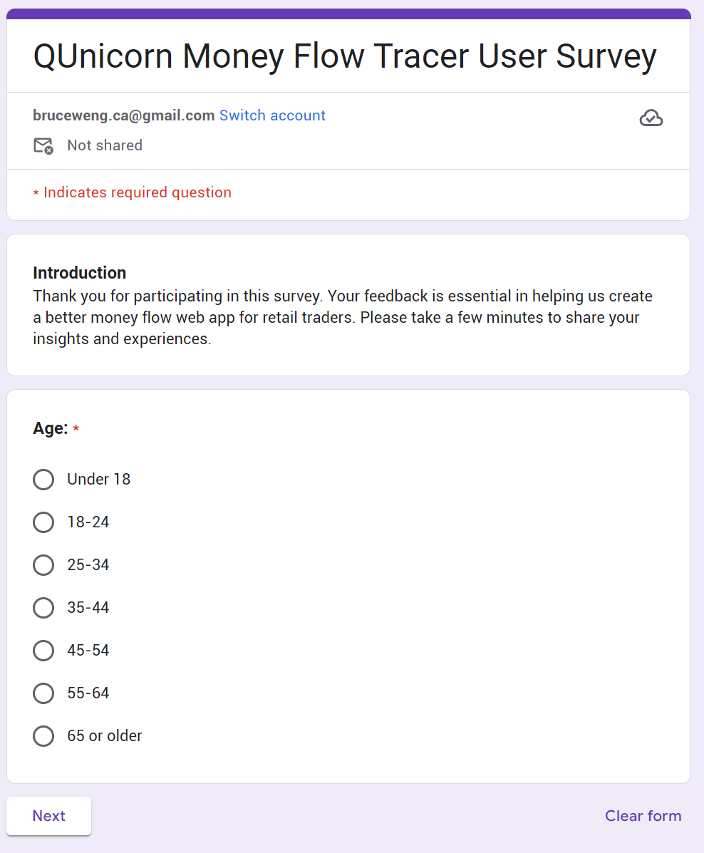
Quantitative Research
Creating a detailed user survey for your target users in a Discord channel is an excellent way to gather valuable insights for our fintech project.
We began with an online survey that generated 98 responses.
Insights
The majority of users express a desire for enhanced data visualization and a more intuitive user experience with guidance for the Money Flow Tracer App.
88% of users prefer clear and intuitive data visualization over plain text.
75% of users find the web app lacking in an intuitive User Interface design.
90% of survey respondents have not used the Money Flow method for trading before but express interest; however, they require guidance to utilize the Money Flow Tracer effectively.
70% of survey respondents fall within the 25-34 age group, characterized as a young, independent, and rational demographic.
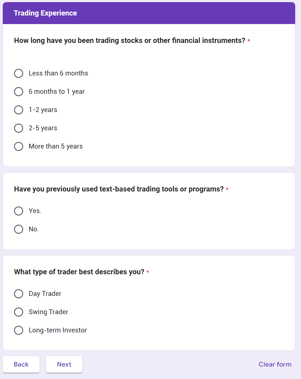
60% of survey respondents have limited trading experience, with most having less than 2 years of experience.
52% of survey respondents check and engage with stock-related information on a daily basis. The majority of respondents identify as Day traders and Swing traders, indicating that most users engage in short-term trading strategies.
Qualitative Research
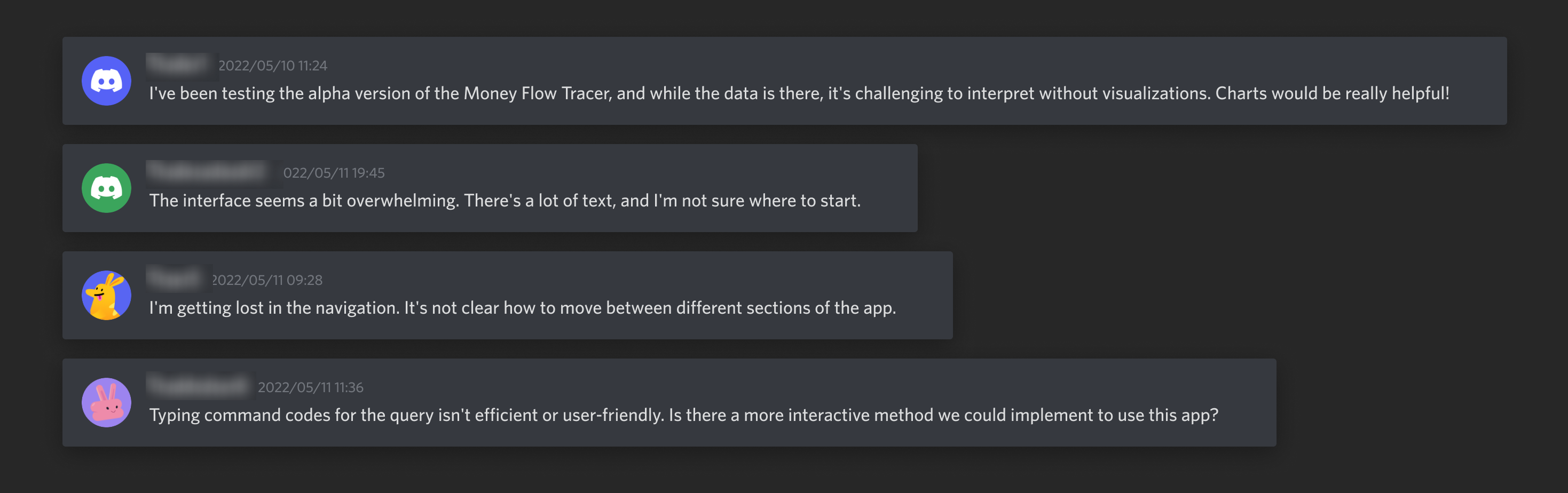
We conducting in-depth interviews with five people from our alpha test user group via Discord. Here are some insights:
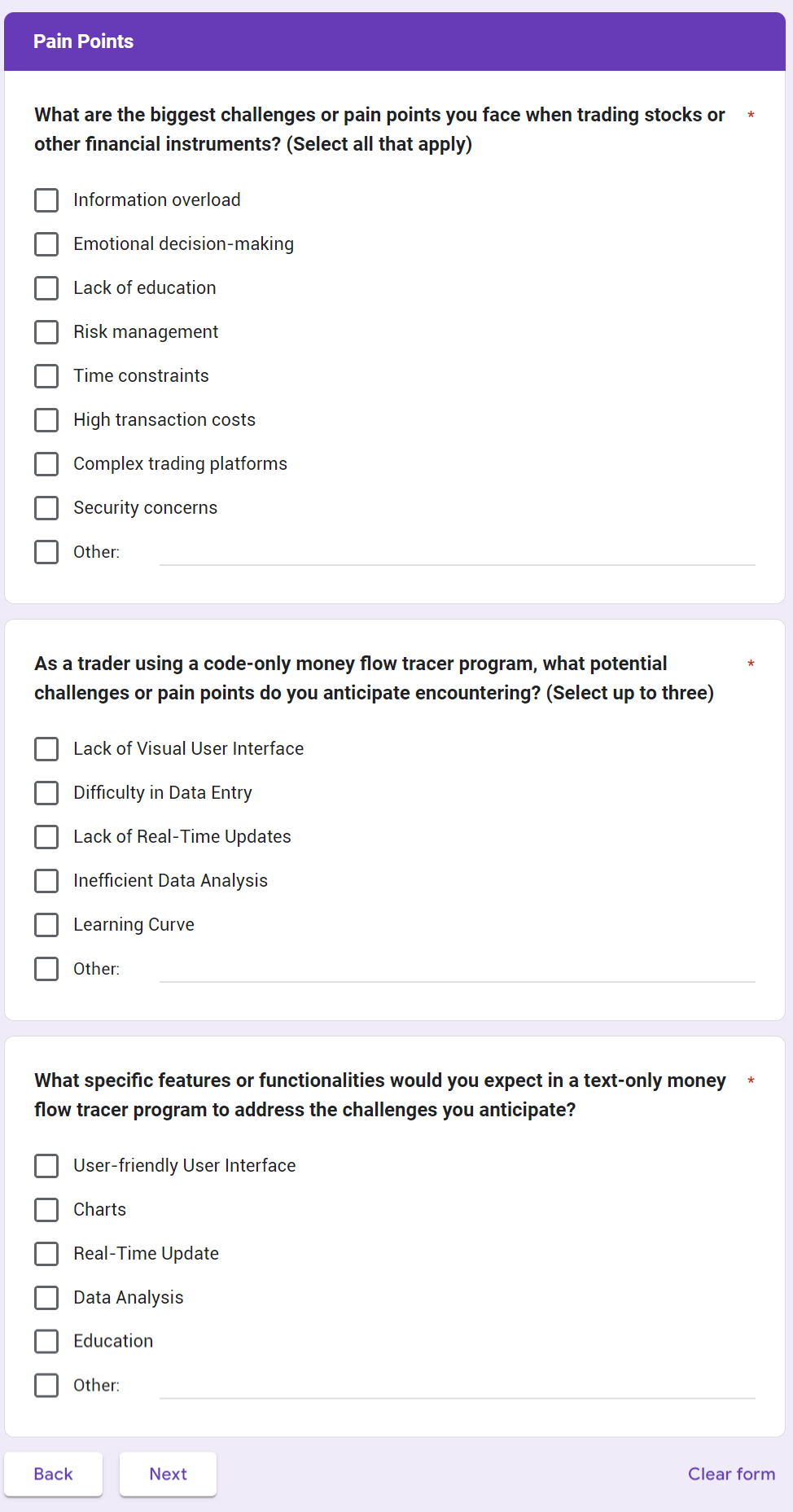
1. Users find analyzing pure data and indicators challenging, desiring a more visual and chart-based approach to interpreting data. Line charts and bar charts were the preferred visual representations for money flow data.
2. Users struggle with the text-heavy user interface, finding it difficult to read and unsure where to start using the app.
3. Users find the navigation, interaction, and analytical logic in the web app somewhat confusing.
4. Users believe that the method of inputting command codes for queries is inefficient and not user-friendly, hoping for a better interactive way to query stock money flows.
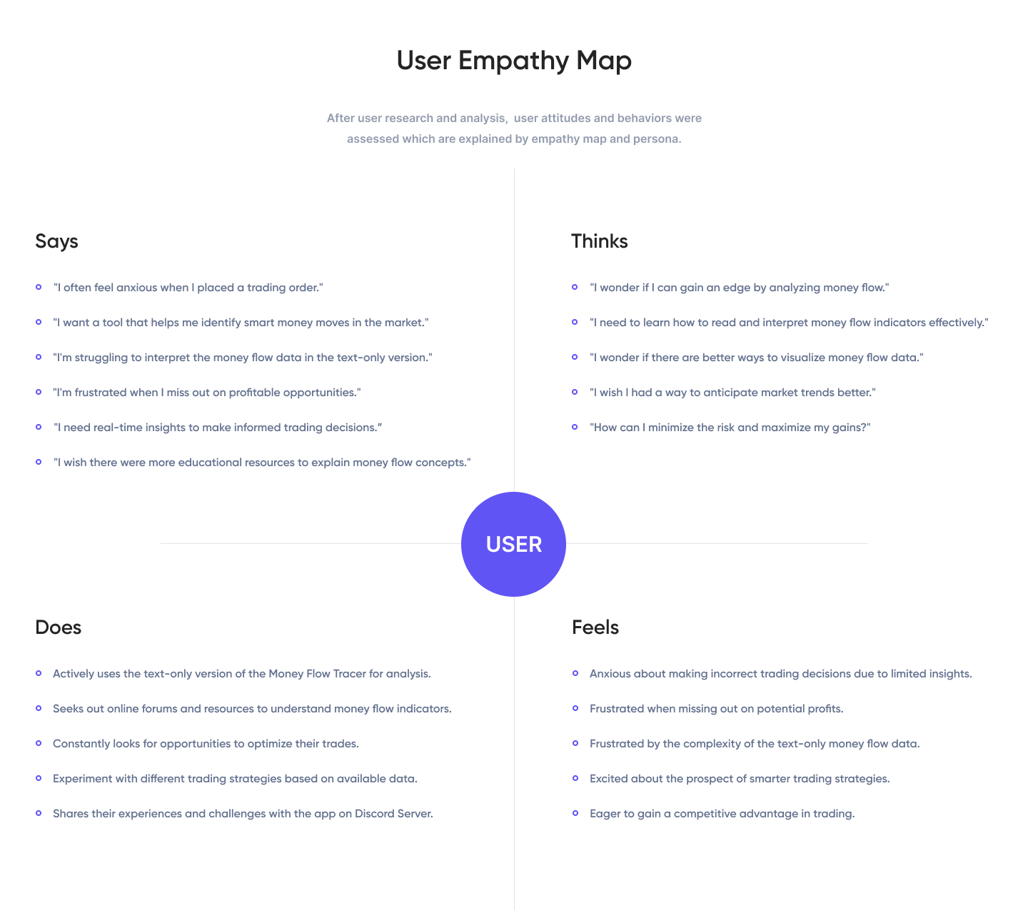
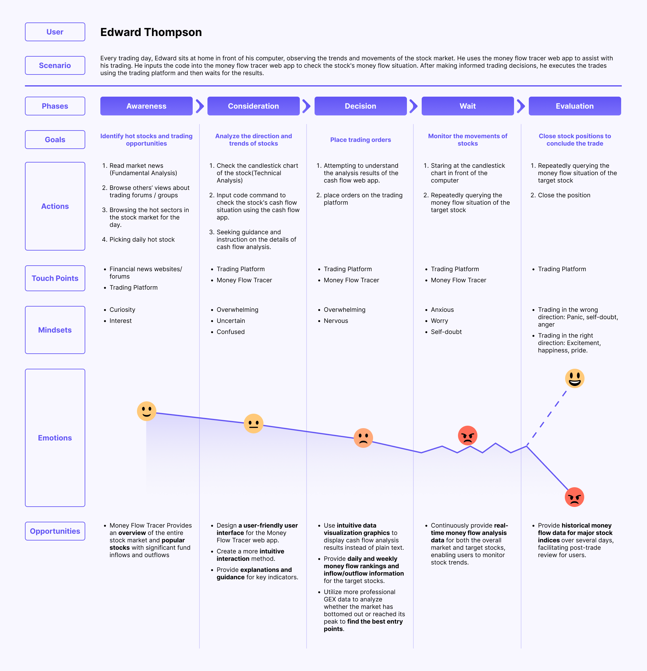
User Empathy Map
Based on the user interview, we created an empathy map to show how our target users interacted with the money flow tracer app while they were trading.
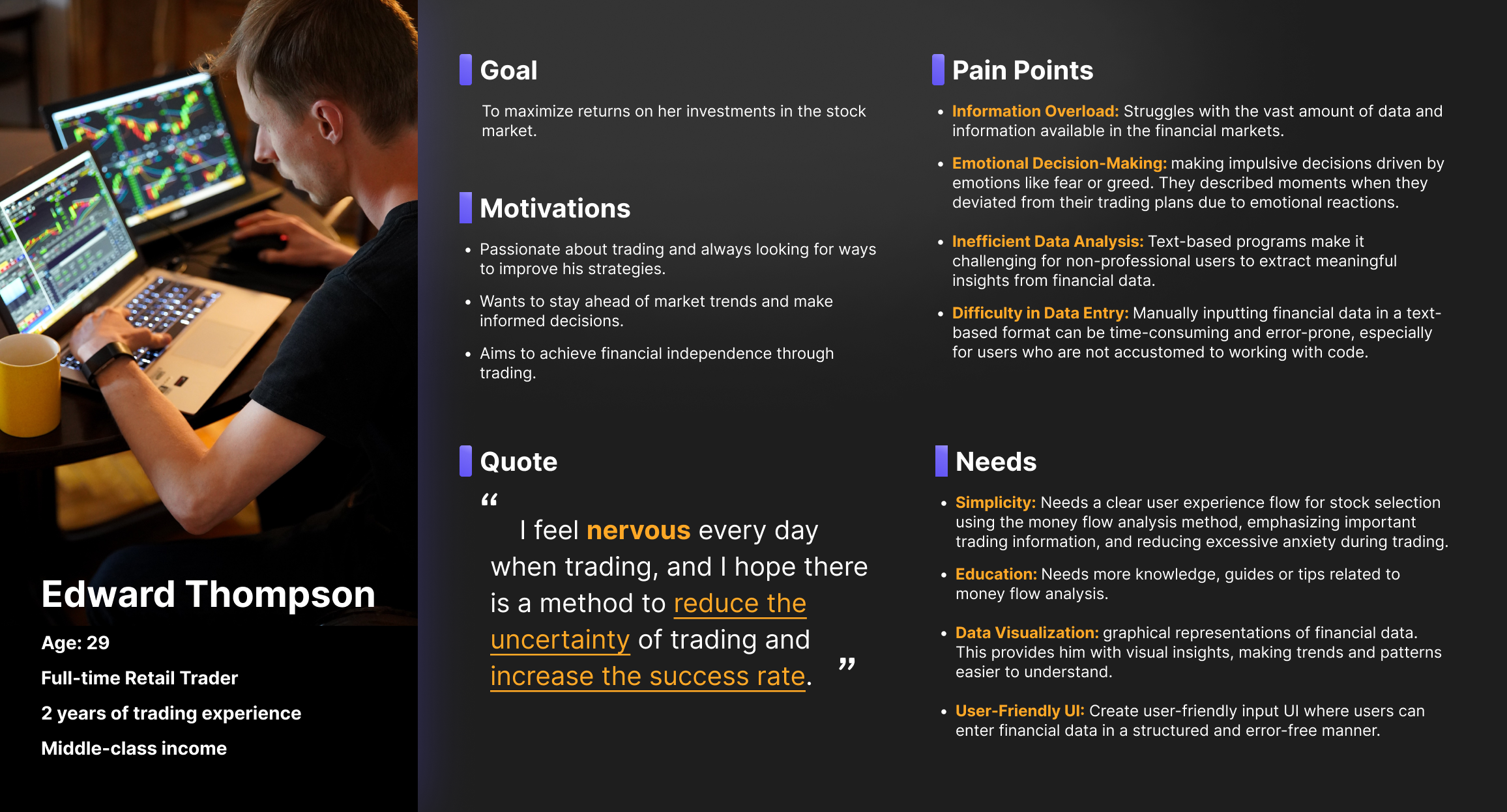
User Persona
User Journey Map
PART 3. DESIGN SOLUTION
Solution
Since most of our target users trade on computers rather than phones, our solution is to design a web app for desktops.
In response to the anxiety and lack of confidence among retail traders regarding market conditions, our solution is to design a user-friendly money flow analysis UX process based on existing quantitative trading algorithms. This aims to assist users in identifying trading opportunities with good risk-reward ratios and high success rates. As a result, it boosts the confidence of retail traders in opening and holding positions, making trading more relaxed.
Analysts, traders, programmers, and I had a brainstorming session to meticulously refine the method of capital flow analysis from the perspective of user use. This is essential for retail traders to better learn and use these steps, thereby reducing blind trading, anxiety, and failure rates in their trades.
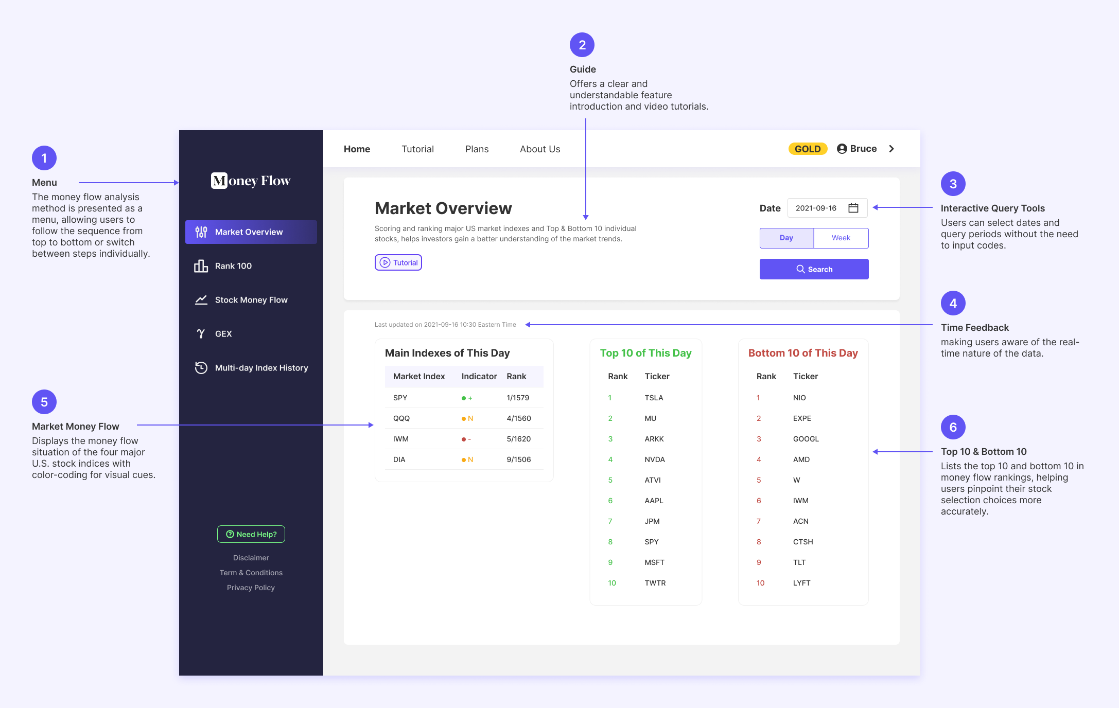
Step 1. Track the overall money flow of the whole US stock market
Step 2. List the top/bottom 100 stocks
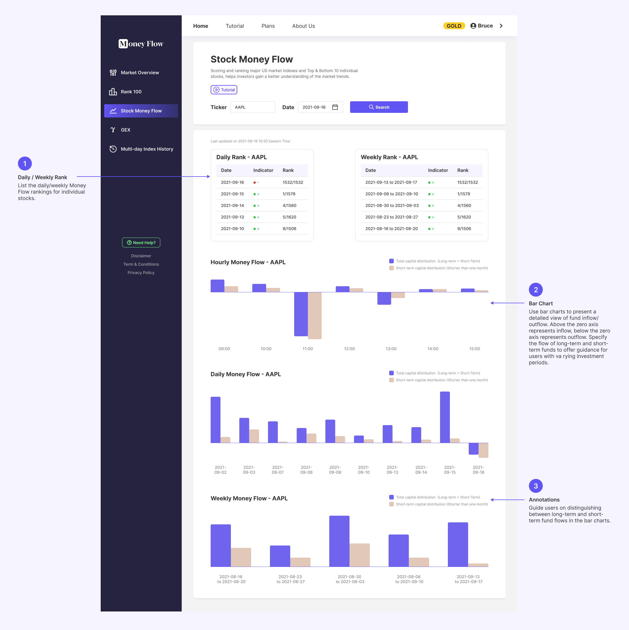
Step 3. Analyze the individual stock money flow
Step 4. Check the bottom or peak of the trend
Step 5. Review the multi-day market money flow
Step 1: Track the overall inflow and outflow of capital for the four major US stock market indices (S&P 500, Nasdaq, Dow Jones and Russell). Analyze the market's direction and sentiment to provide retail traders with an overview of the daily market, setting the tone for their trades.
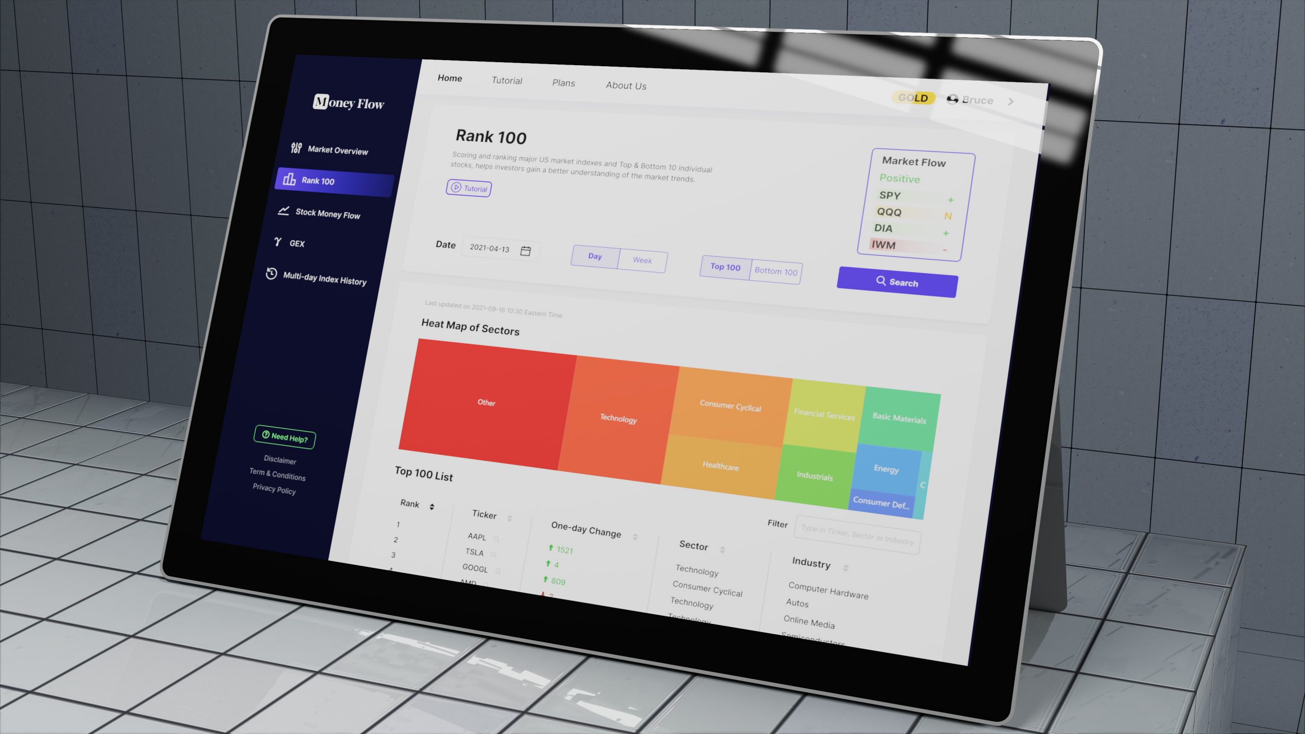
Step 2: List the top 100 stocks with the highest smart money inflows and the bottom 100 stocks with the highest outflows for user reference. This greatly narrows down the range of stocks for users to consider trading.
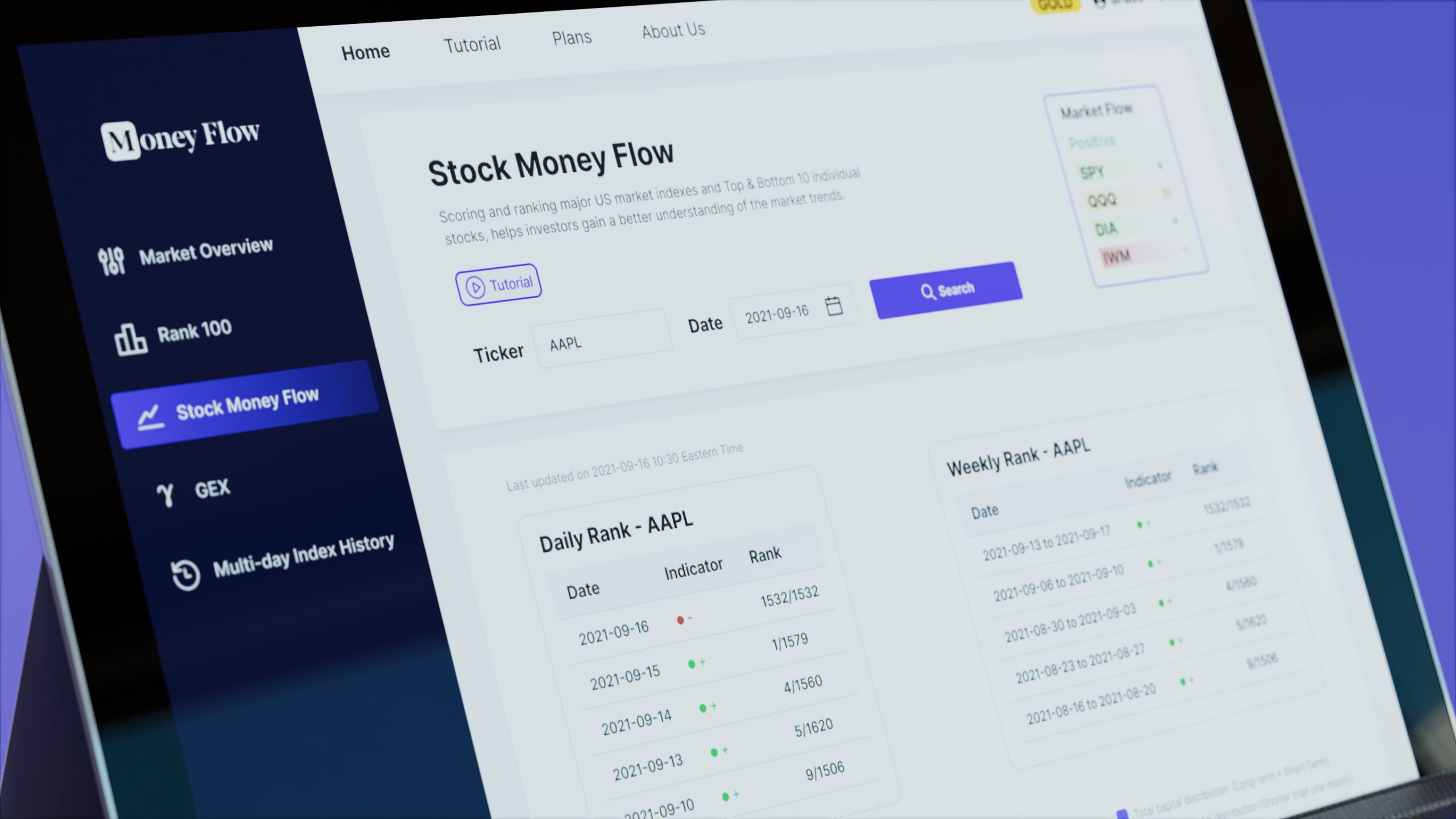
Step 3: Analyze the multi-day detailed inflow and outflow of funds for individual stocks, further confirming whether a stock has a sufficient smart money inflow or outflow to decide whether to go long or short on that stock for the day. This provides users with a basis for their trades and enhances confidence.
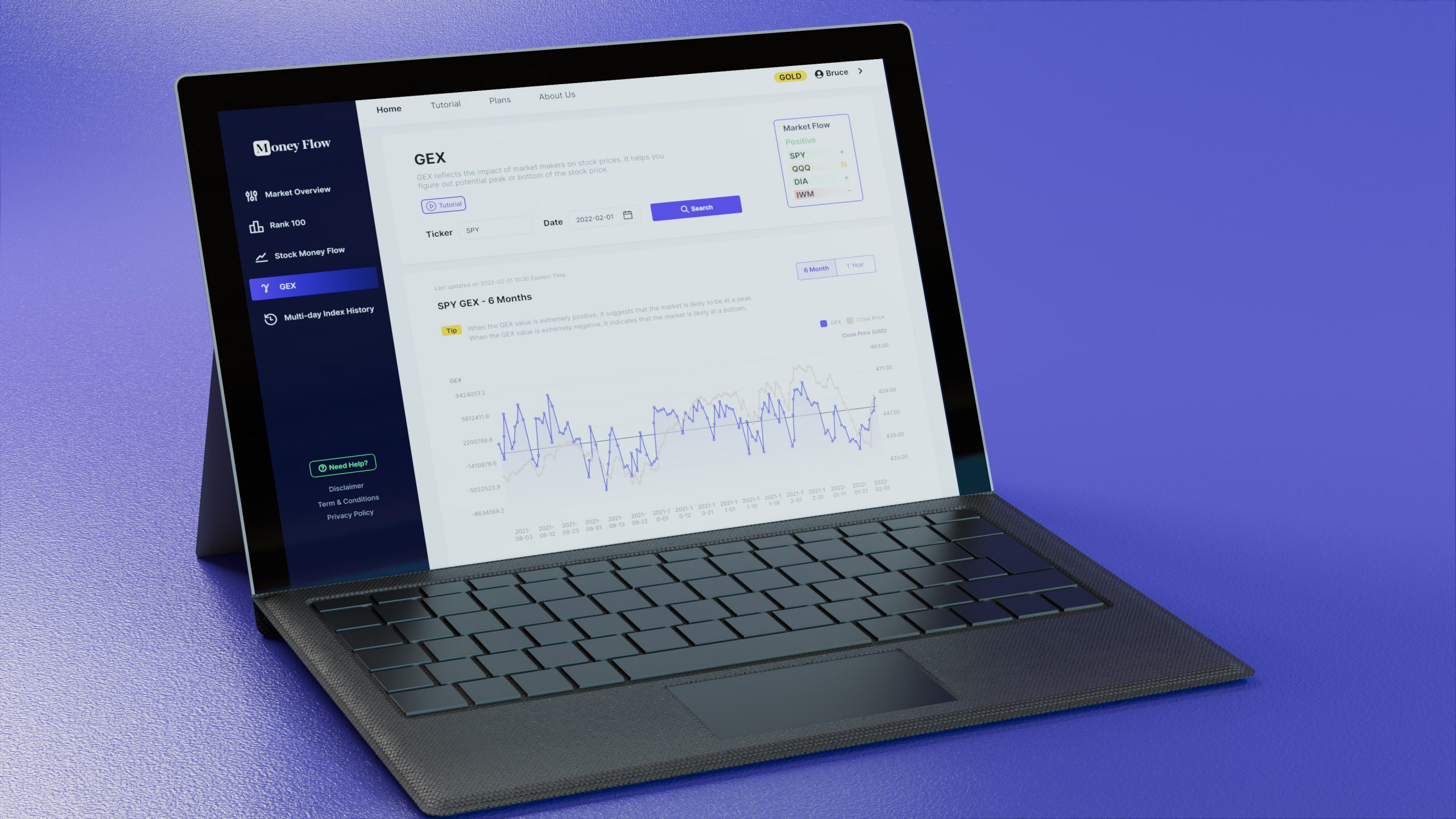
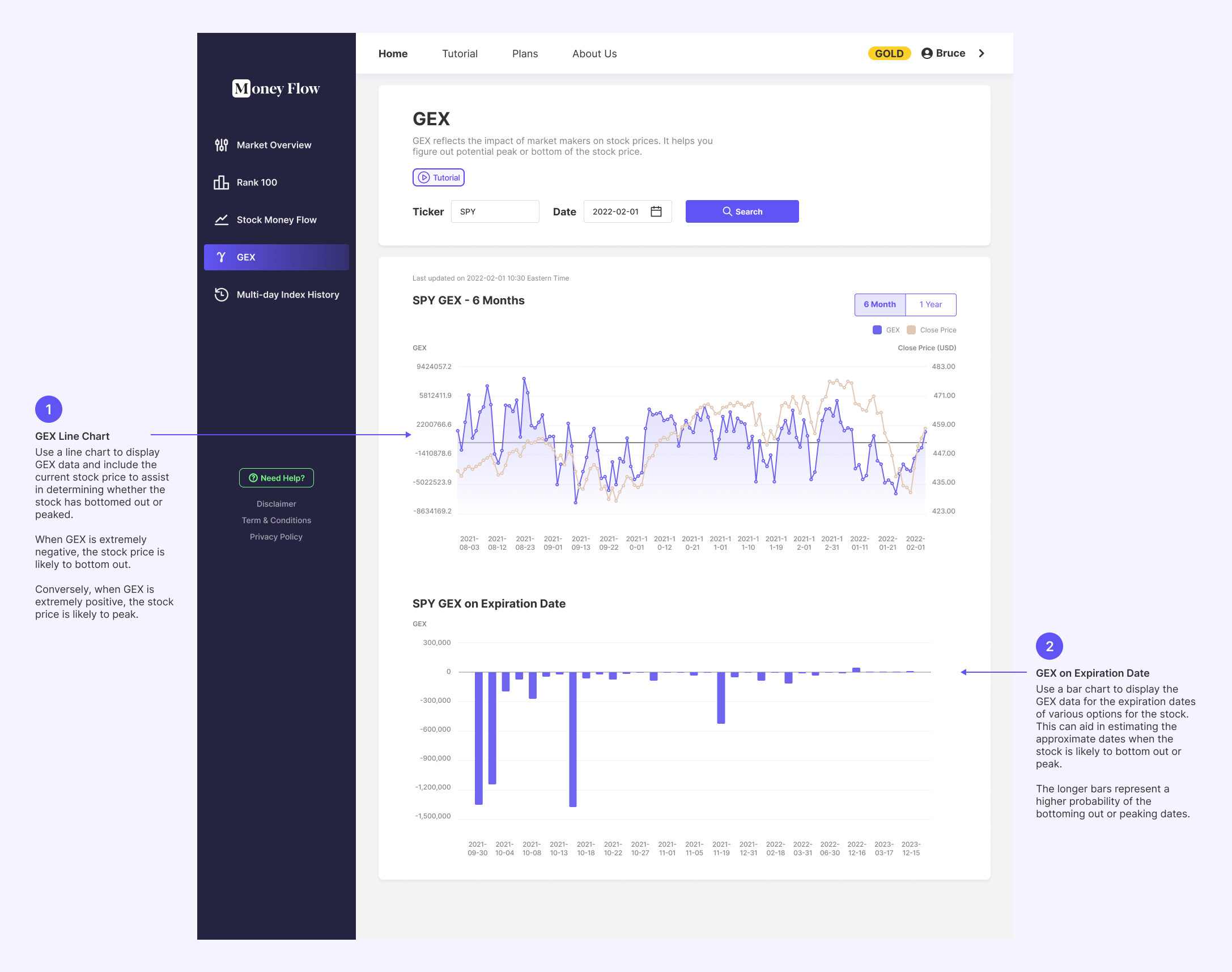
Step 4: Utilize professional GEX data to assist users in analyzing whether a particular stock's trend has bottomed out or reached its peak. Help users identify the optimal entry points, thereby increasing the probability of profitable trades.
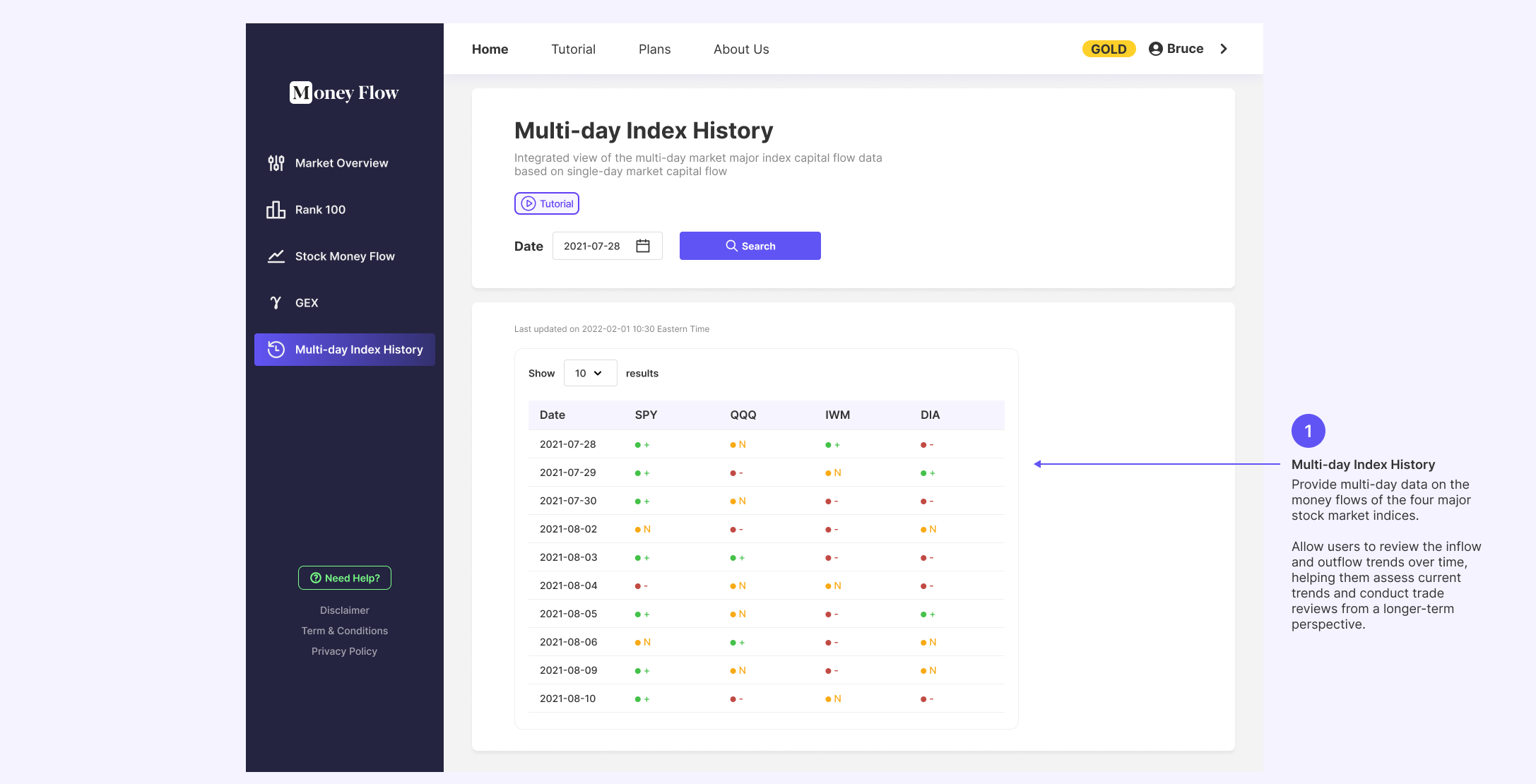
Step 5: Provide multi-day data on the fund flows of the four major stock market indices. Allow users to review the inflow and outflow trends over time, helping them assess current trends and conduct trade reviews from a longer-term perspective.
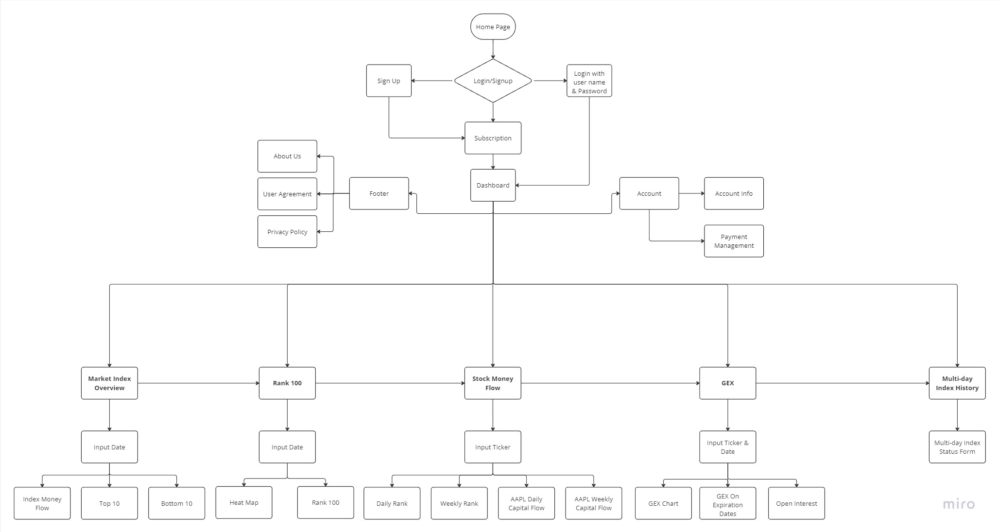
Information Architecture
I organized the method of money flow analysis into a flowchart. This helps streamline the information architecture of the web app and lays a solid foundation for the subsequent interface design.
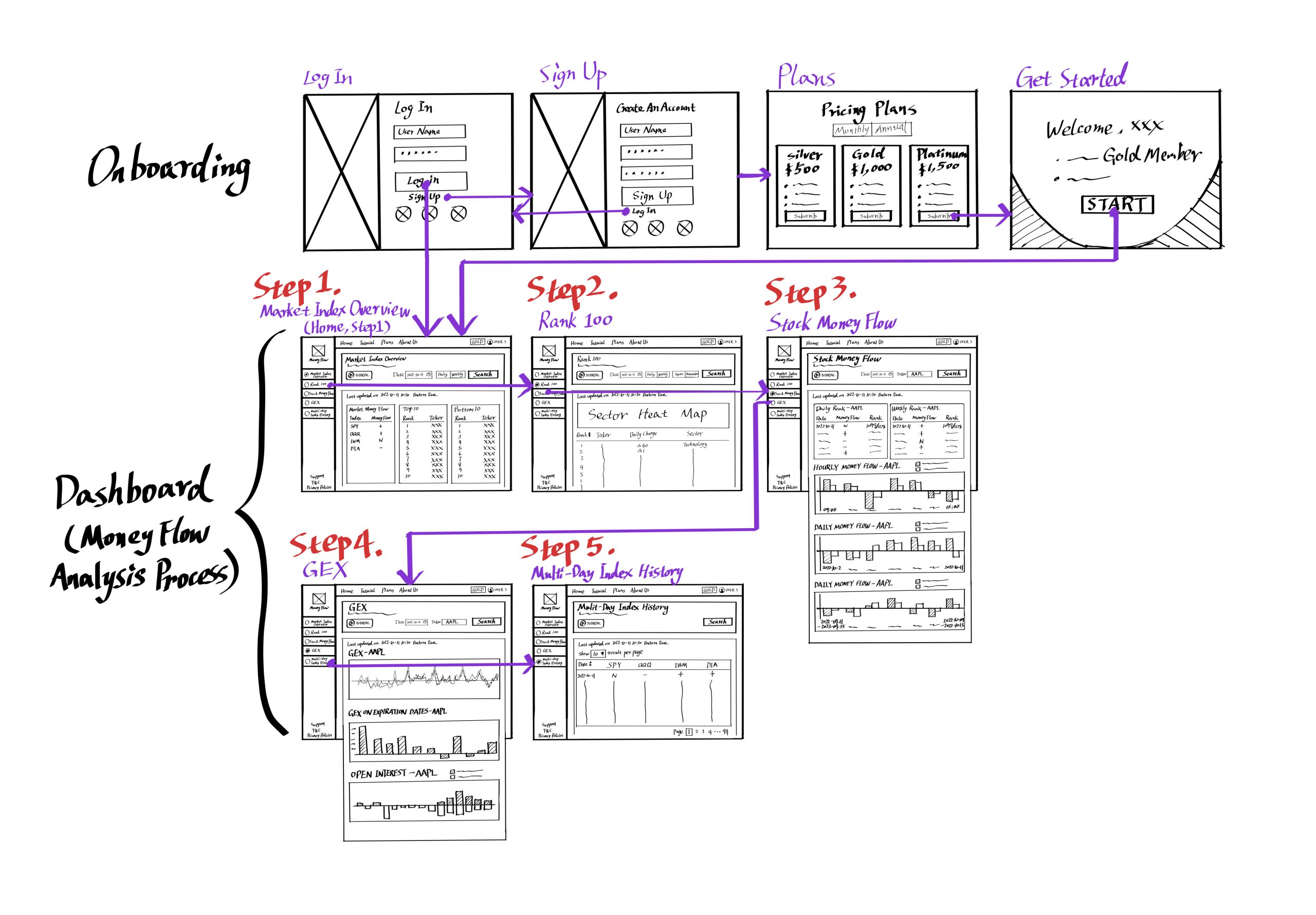
Wireframe Sketch
Design System
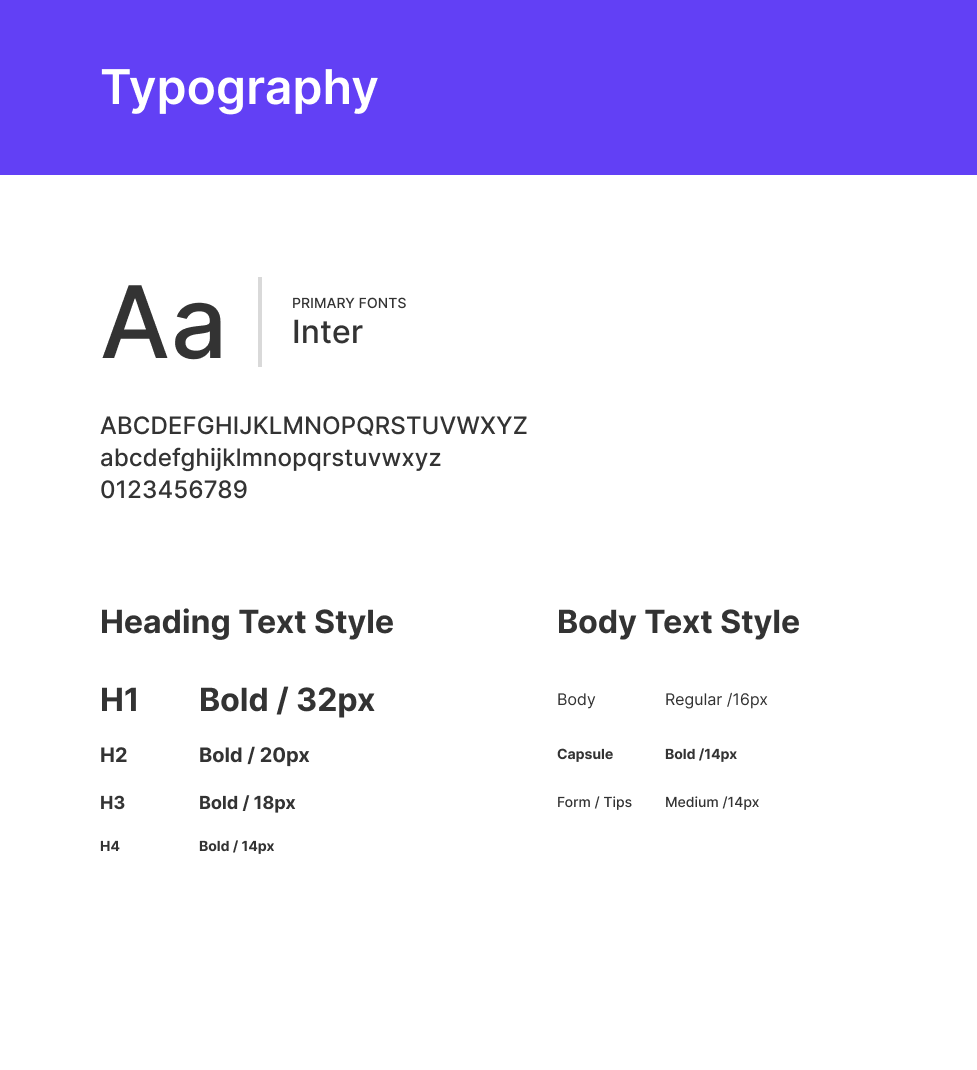
Typography:
I chose the "Inter" sans-serif font as the primary font for the Money Flow Tracer web app. Whether used at large or small sizes, Inter maintains great readability. It can display information clearly and aesthetically. Not only does this make it easier to differentiate between upper and lowercase letters, but it also helps create space between lines of text. It is a highly suitable neutral font for web UI.
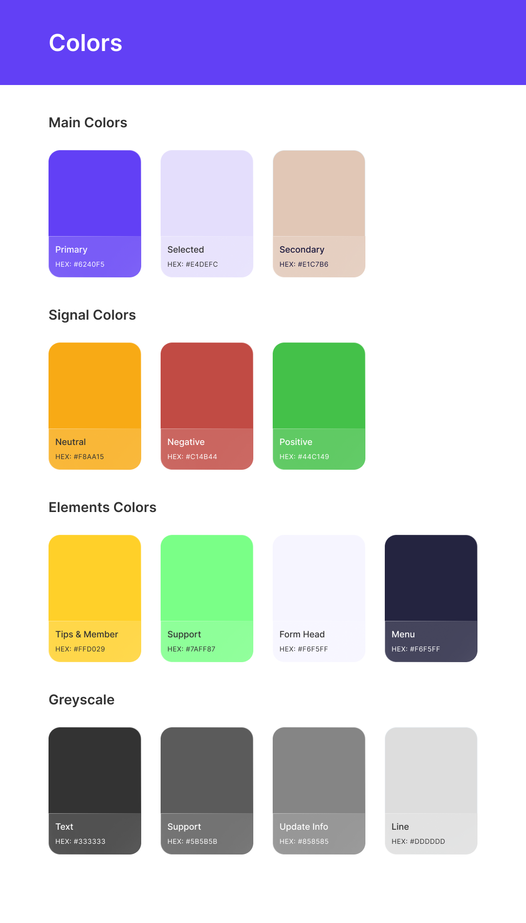
Colors:
I chose purple as the primary color for the web app because purple is associated with regality and mystery, which is well-suited to the spirit of securities trading—wealth and uncertainty. Purple is also commonly used in North American fintech startups. For the remaining parts, I mainly used white to give the app a clean visual style. In addition, regarding the colors of signal indicators, I used red and green to make them the same as stock price rise and fall signals, along with yellow to represent neutrality. This allows users to quickly find the consistency between signal indicators and stock trading.
UI Components:
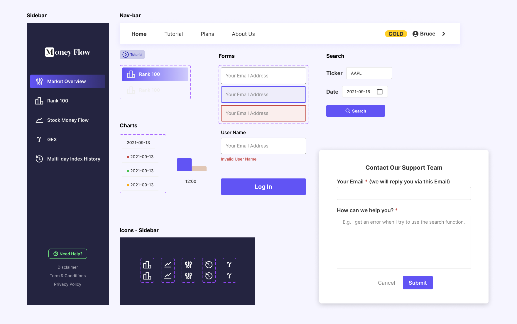
Since this is a query tool-type web app, the component library mainly consists of forms, charts, buttons, and some small icons.
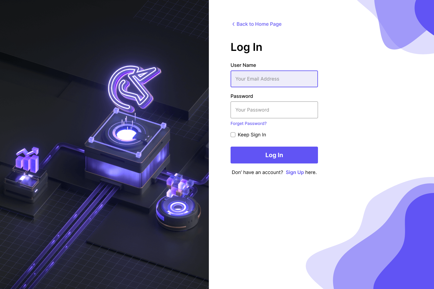
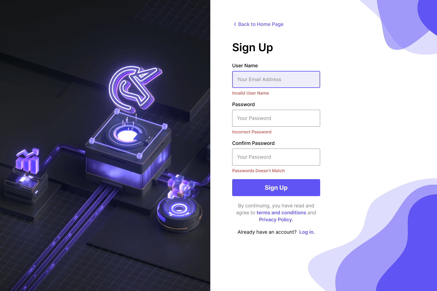
UI Design
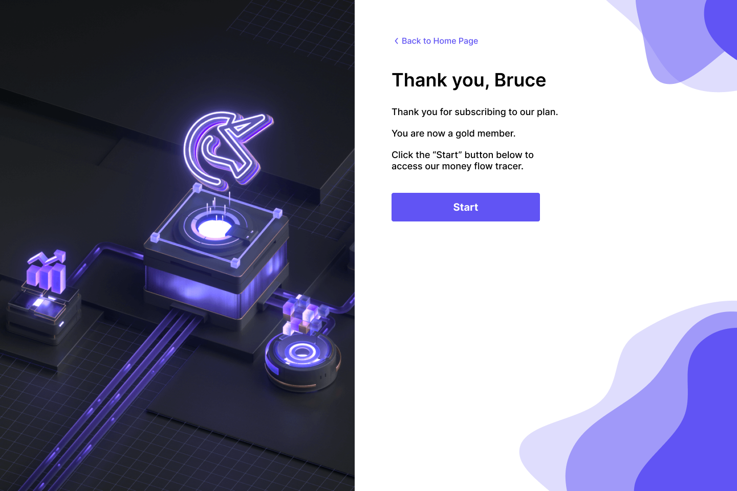
Get Started
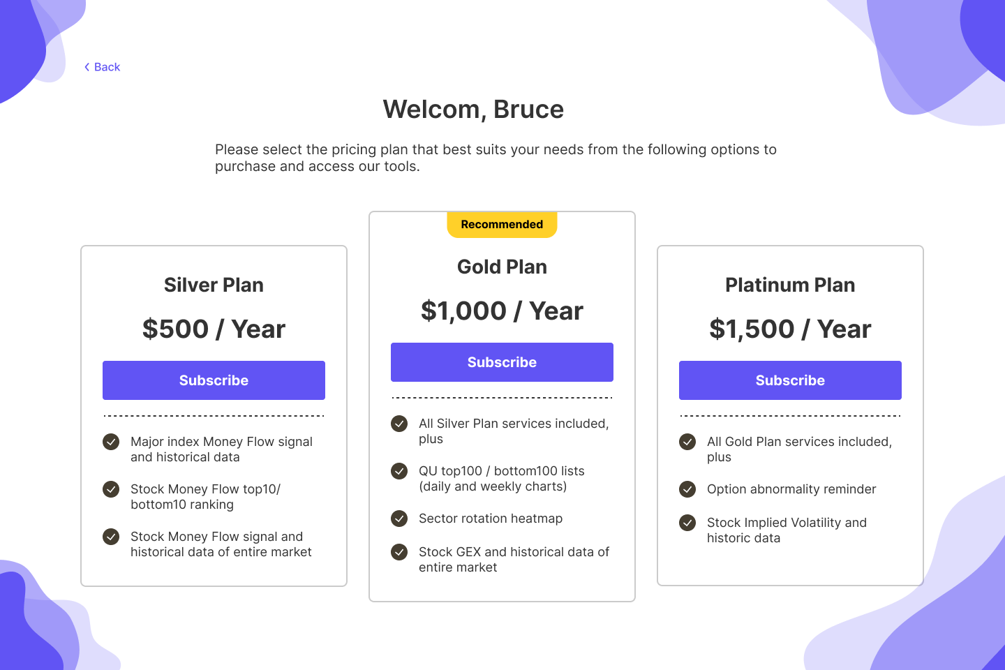
Just enough information: Users only need to provide basic information to sign up. This decreases the data input so that the entry barrier is low.
Concise Plan Selection: Help users quickly understand the key points of each plan and reduce the time it takes to make a choice.
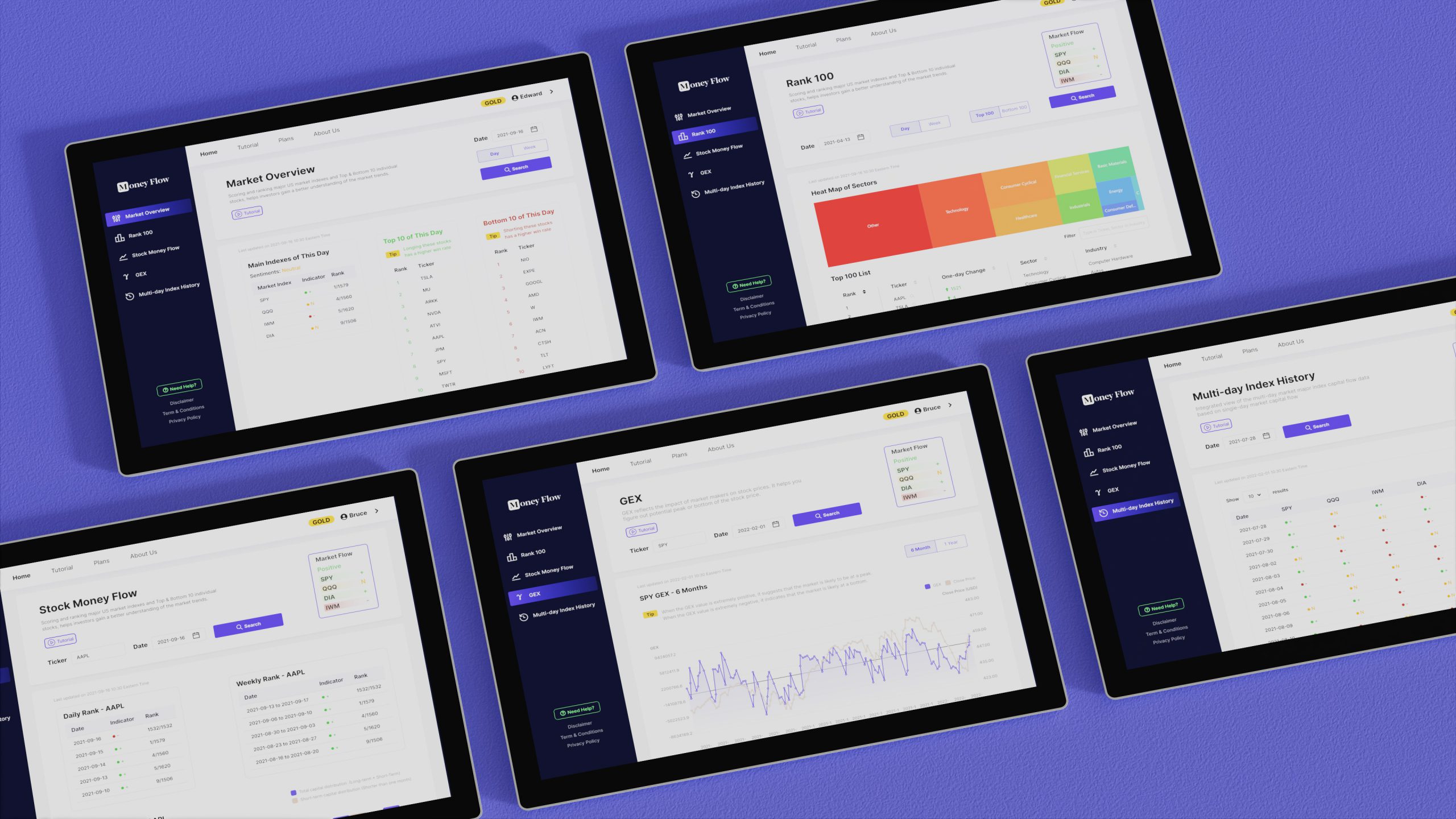
STEP1. Market Overview
STEP2. Rank 100
STEP3. Stock Money Flow
STEP4. GEX
STEP5. Multi-day Index History
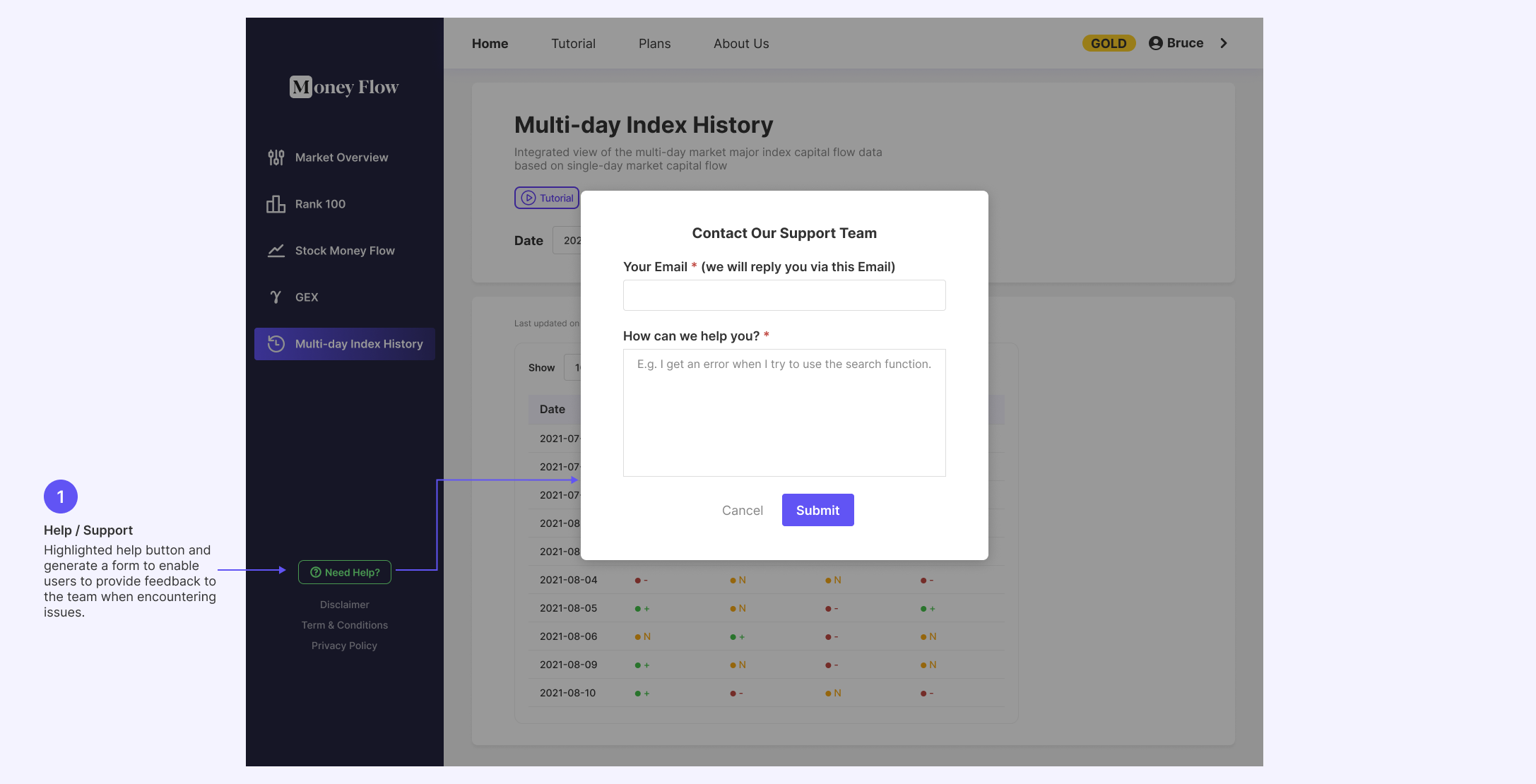
Support
PART 4. USABILITY TEST
Usability Testing
We invited 5 participants with varying trading experience to take part in our usability testing. The testing was conducted via Discord's video conferences for communication and recording their reactions. We observed participants' interactions with the web app by screen sharing.
UX Metrics
Task Success Rate, Time-on-Task, Error Occurrence Rate
Research Goals
1. Determine if users can complete core tasks within the app.
2. Assess the usability, functionality, and user-friendliness of the app.
3. Determine if the app effectively assists traders in making trading decisions based on smart money indicators.
4. Gather feedback to identify areas for improvement in each of the five app features.
Research Questions
1. Are there parts of the user flow where participants get stuck?
2. Are there design changes we can make to improve the user experience with the app?
3. Can the users understand the function of different features?
4. How long does it take a user to complete the main tasks?
5. Do users think the app is easy or difficult to use?
Tasks
Task 1: Create an account on the app
Ask users to create an account and subscribe to the Gold membership (free during the testing phase) to access the full app.
Task 2: Track Market Direction
- Instruct the participant to use the app to track the capital flow for the four major US stock market indices (S&P 500, Nasdaq, Russell and Dow Jones).
- Observe how they analyze the market's direction and sentiment.
Ask participants to share their overall impression of the market for trading decisions.
Task 4: Evaluate Individual Stocks
- Instruct the participant to analyze the multi-day inflow and outflow of funds for individual stocks to decide whether to go long or short on a stock for the day.
- Observe their approach and decision-making based on the app's data.
- Ask for feedback on how confident they feel in their trading decisions.
Task 5: Utilize GEX Data
- Ask participants to use professional GEX data in the app to assess whether a stock's trend has bottomed out or reached its peak.
- Observe their analysis and decision-making process.
- Inquire about the effectiveness of the app in identifying optimal entry points.
Task 6: Multi-Day Fund Flow Analysis
- Instruct participants to review multi-day data on fund flows for the three major stock market indices.
- Observe how they assess current trends and conduct trade reviews from a longer-term perspective.
- Ask for feedback on the usefulness of this feature.
Key Findings and Insights
Successes
- All users completed the tasks, some taking a few extra minutes.
- All users think that the current improvements are far more user-friendly than the previous text-only version of the web app and have enhanced efficiency.
- All users mentioned that the new app design reduced their anxiety during trading and boosted their confidence in trading.
- Most users mentioned that the revised app deepened their understanding of the process of money flow analysis and helped them more accurately identify good trading opportunities.
New Problems Found:
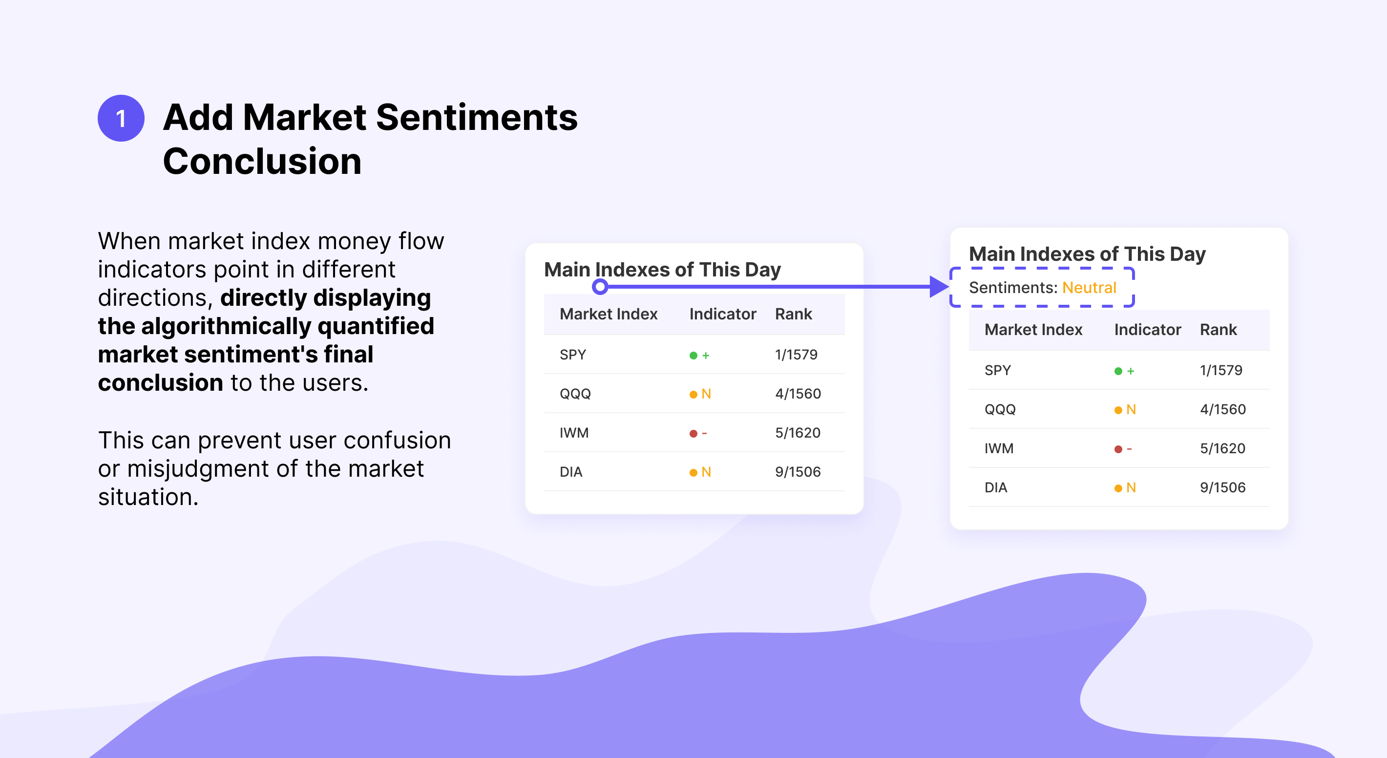
- Some users feel confused when the overall market money flow signals move in different directions.
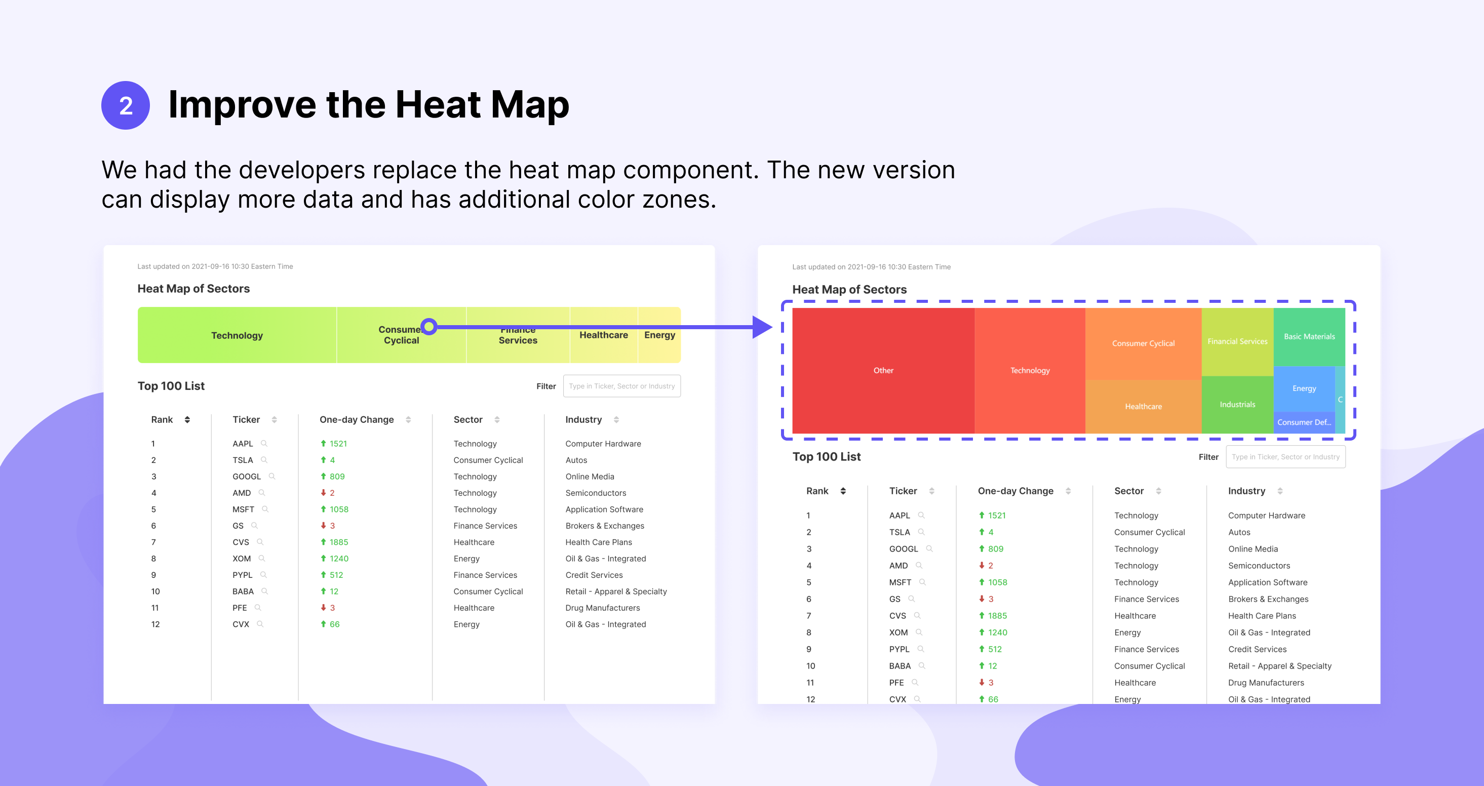
- The amount of data displayed in the heatmap is not sufficient, and the distinction between sections is not very clear.
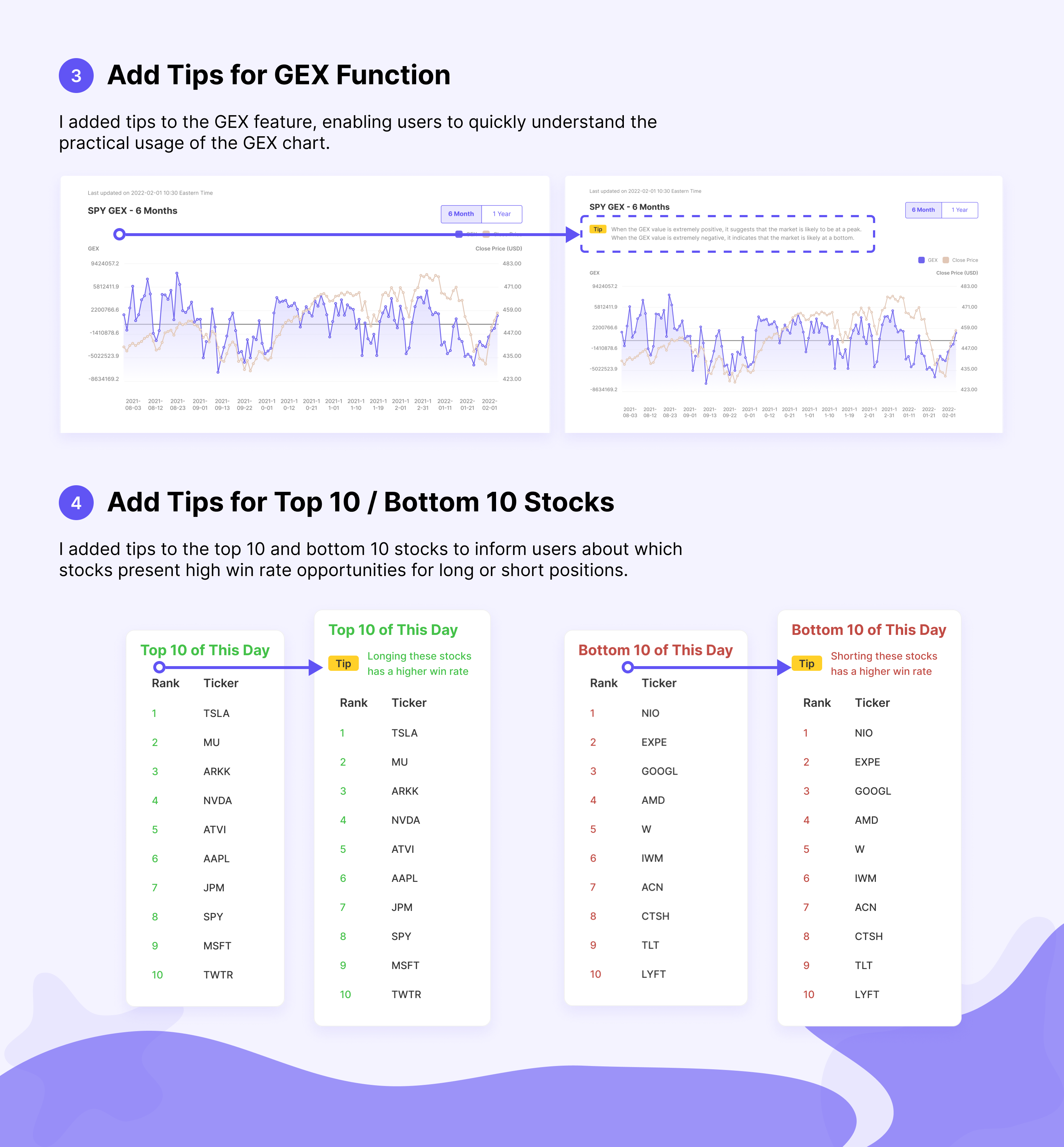
- GEX data significantly reduces the pressure on experienced traders when making trading decisions, but some novice traders may not understand the utility of GEX.
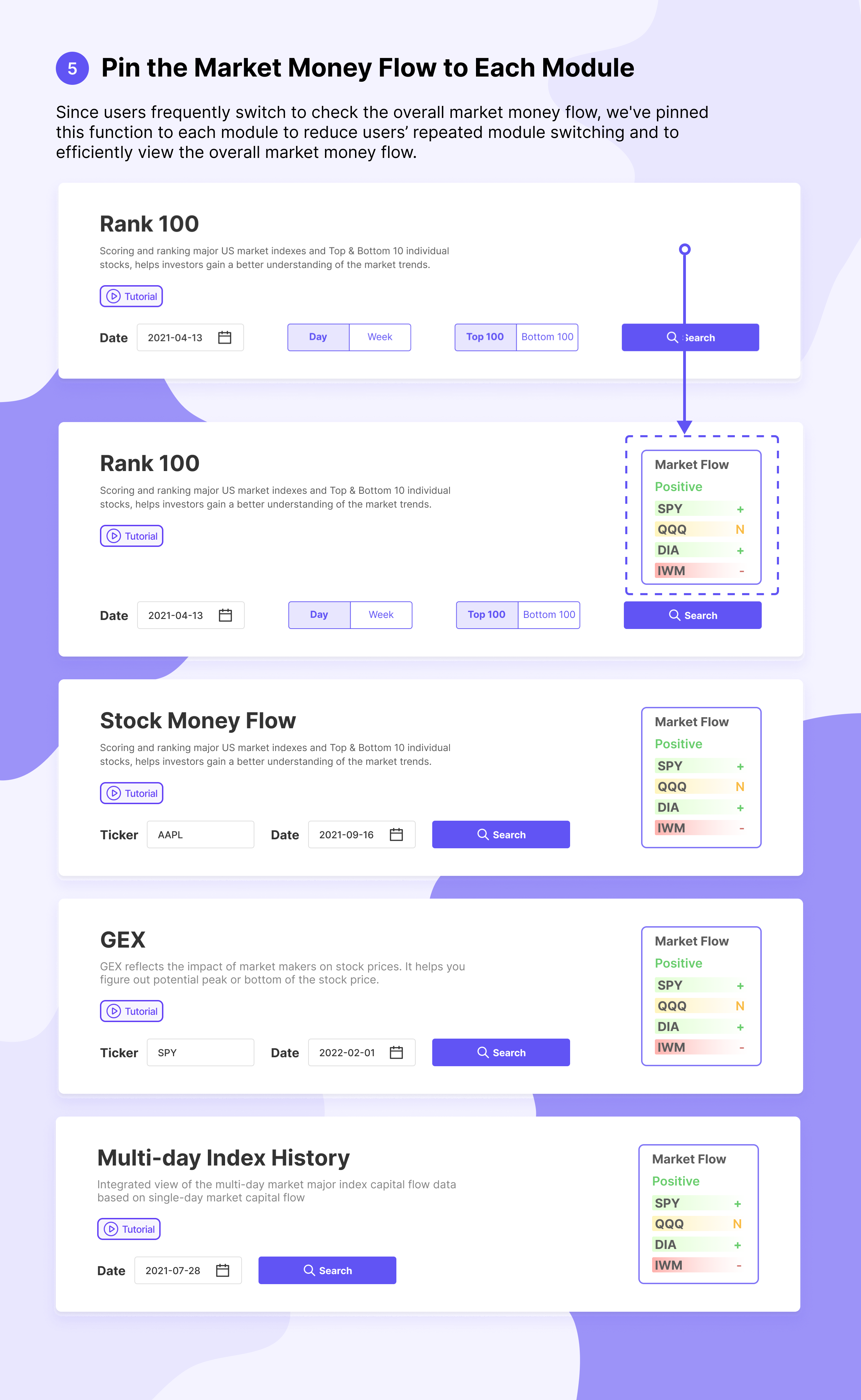
- The majority of the respondents frequently switch back and forth between steps, especially in the "overall market money flow" module. They often return to this module for additional queries.
PART 5. ITERATION
PART 6. FINAL DESIGN PROTOTYPE
OUTCOME
Following a period, we released a new satisfaction survey on our Discord Server and received the following results:
400+ New users have gained within one month after launch(The service is free during this test Period).
The new design significantly improved user satisfaction, increasing from 30% to 75%.
80% of users indicated that the data visualization made the use of the Money Flow Tracer Web App more efficient, improved the clarity of the analysis logic, and increased usage frequency.
75% of users mentioned that the new design improved their learning of money flow analysis methods.
60% of users indicated that the redesigned Money Flow Tracer Web App provided better trading opportunities, reducing anxiety during trading and boosting confidence in their trading decisions.
LESSONS LEARNED
Talk to People: The development of a tool app involves extensive user feedback. I had the opportunity to plan and conduct interviews and user usability studies. These actions provided me with valuable experience and improved my ability to communicate with others.
Data Visualization & Product Logic: This project taught me how to combine data visualization with specific stock trading analysis processes. It was a great opportunity to merge my UX and financial knowledge.
Ability to analyze the design solution: Through interactions with traders, analysts, and users, I gradually enhanced my ability to deeply analyze design decisions and consider design solutions for users.
Selected Works

7Link AppProduct Design
Visual DesignVisual Design
Stock Money Flow TracerUX / UI Design
UI-Plant Shop AppUI Design
SAAS Product Responsive Web DesignWeb UI Design
OTT RemitUX Design