OTT Remit
Mobile App Design | UX Case Study
A fast, simple, and secure solution for remittances from Canada to China.
Role
Product Designer
Client
OTT Financial Group
Date
June 2019
Duration
4 Weeks
Responsibilities
- Define the problem and figure out the product strategy
- Conduct user research & user interviews
- Analyze users and scenarios
- Create User Flow, Information Architecture & Wireframe
- Usability Test & Iteration
- Design Guide & Components library
- UI Design
- Render Final Mockup images and videos
*Disclaimer: This UX case study is intended to demonstrate the design process, design skills, and overall outcomes. To safeguard the commercial confidentiality of the client company, certain contents have been modified, and they may vary from the released product.
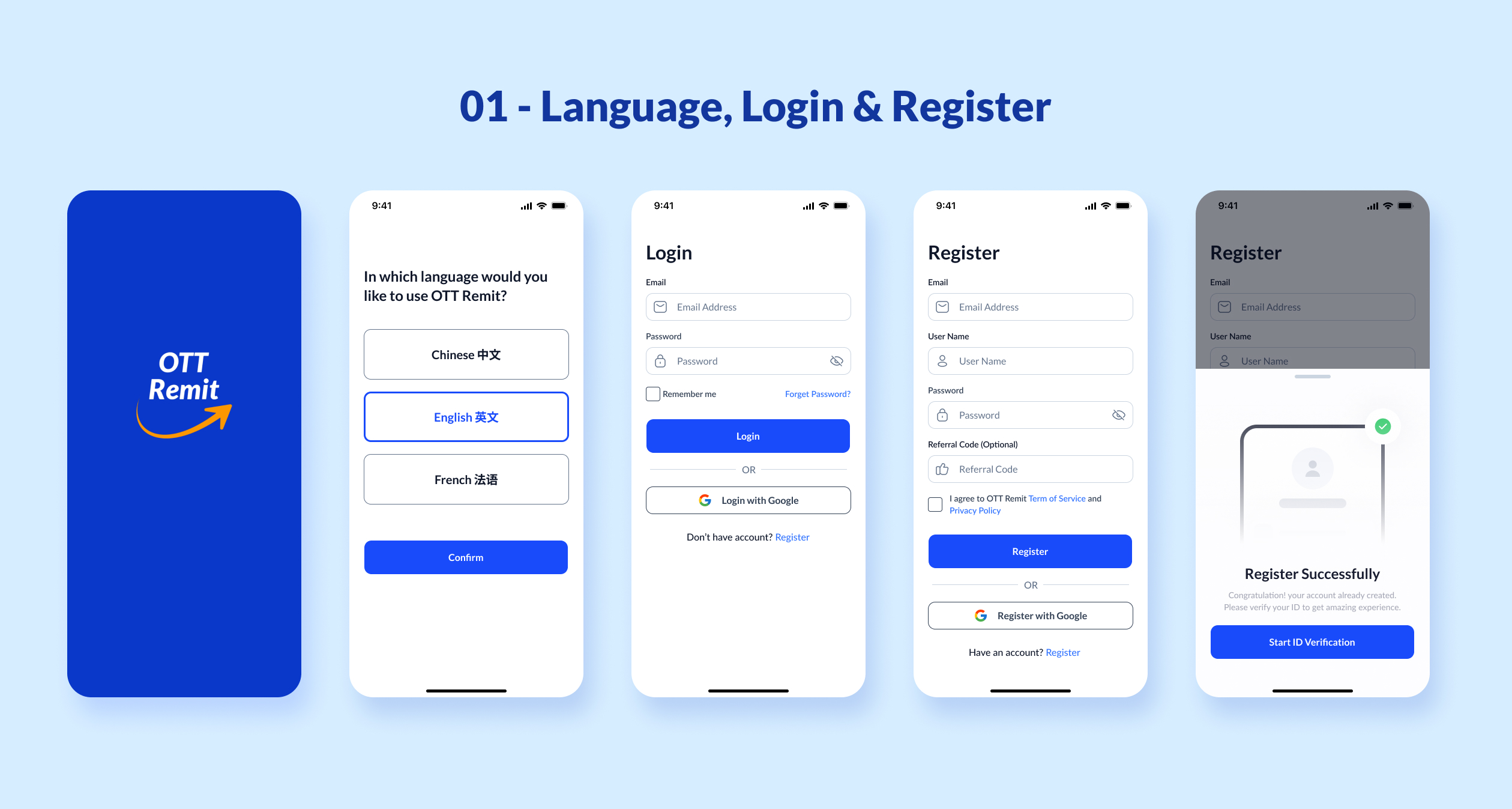
What's OTT Remit?
OTT Remit is a remittance mobile app by OTT Financial Group that digitalizes traditional offline remittance services. It primarily targets the user base of Chinese immigrants in Canada.
This app exists to address the challenges faced by Chinese immigrants in Canada when sending remittances to China.
The goal is to create a user-friendly, secure, and efficient solution to facilitate cross-border money transfers for Chinese immigrants in Canada.
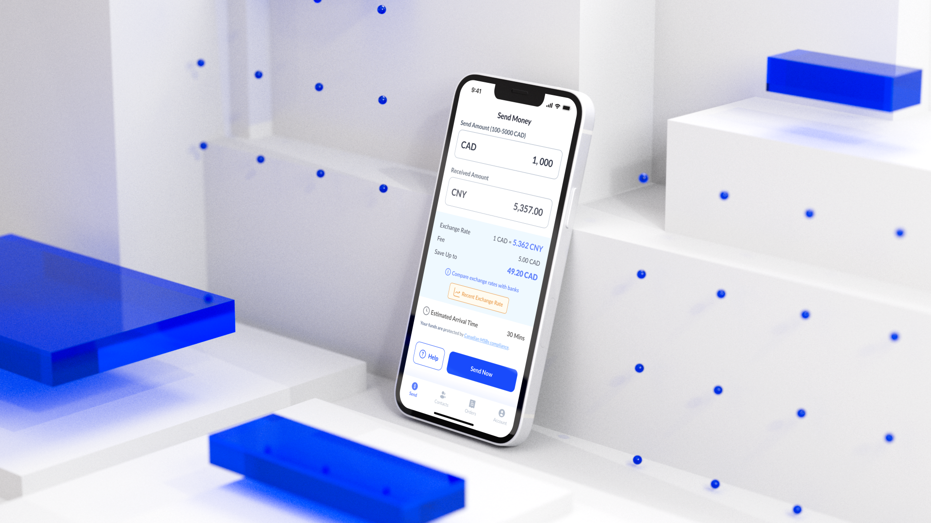
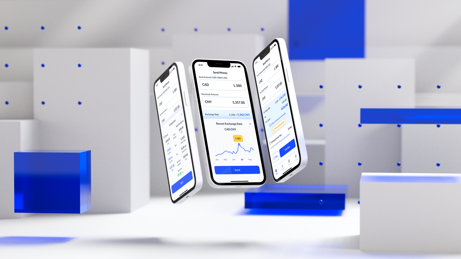
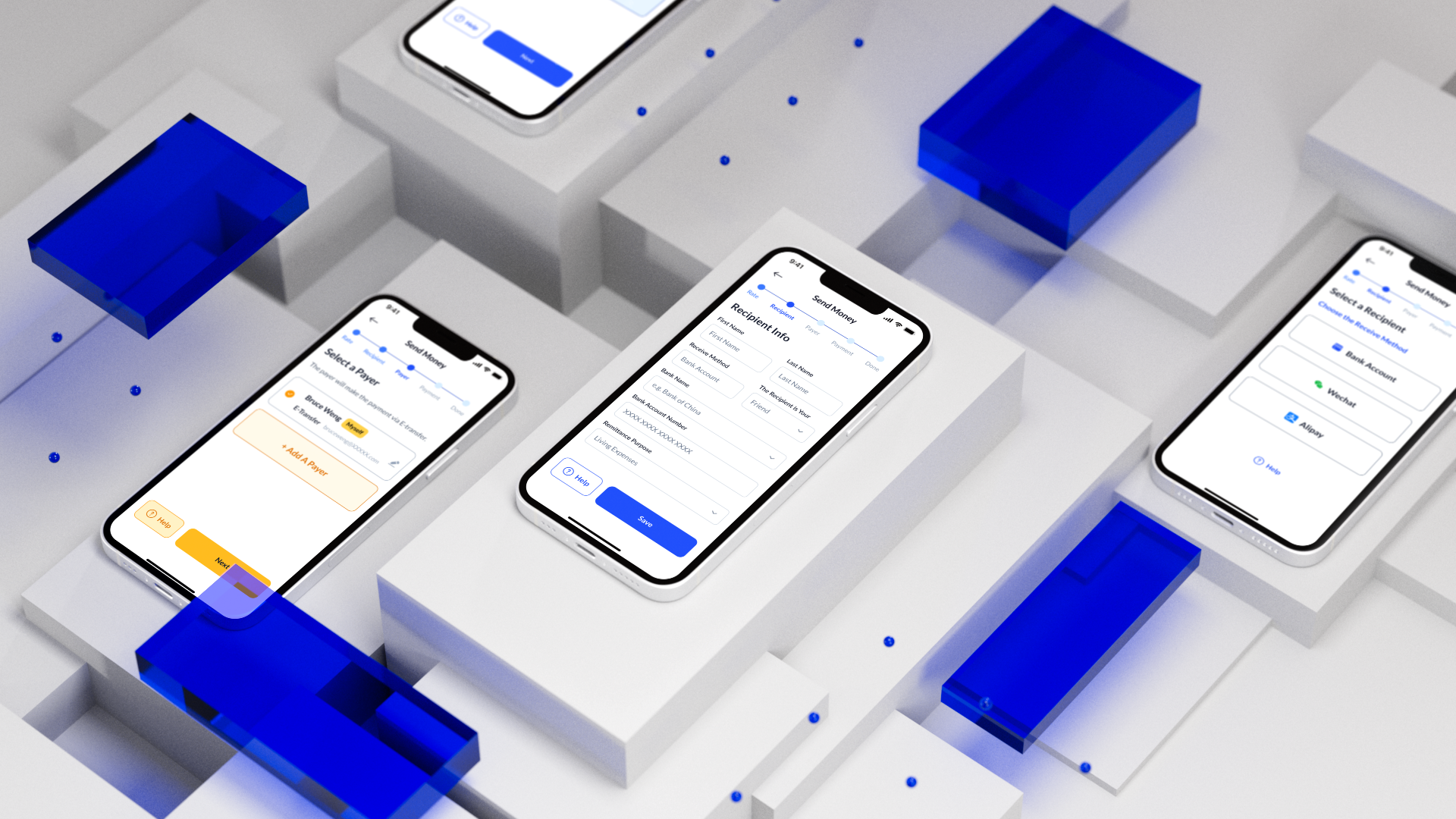
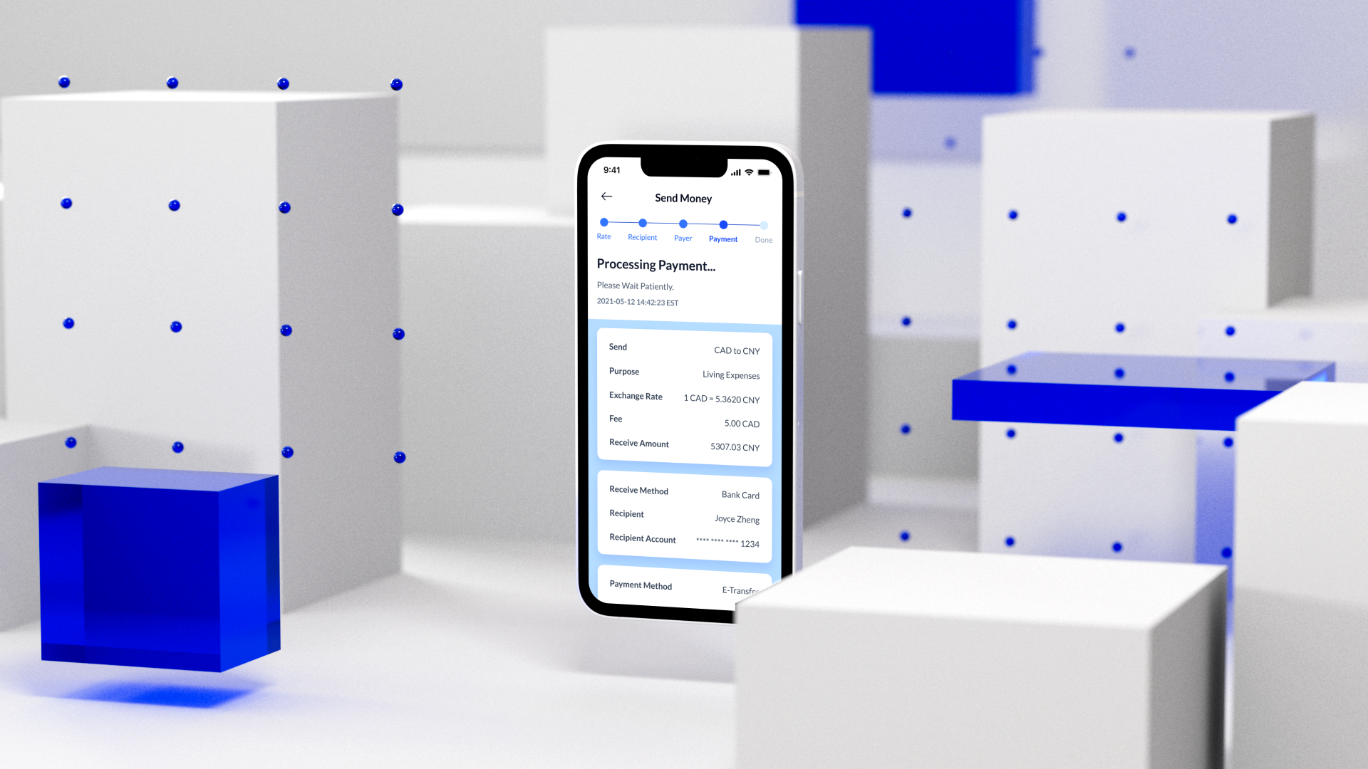
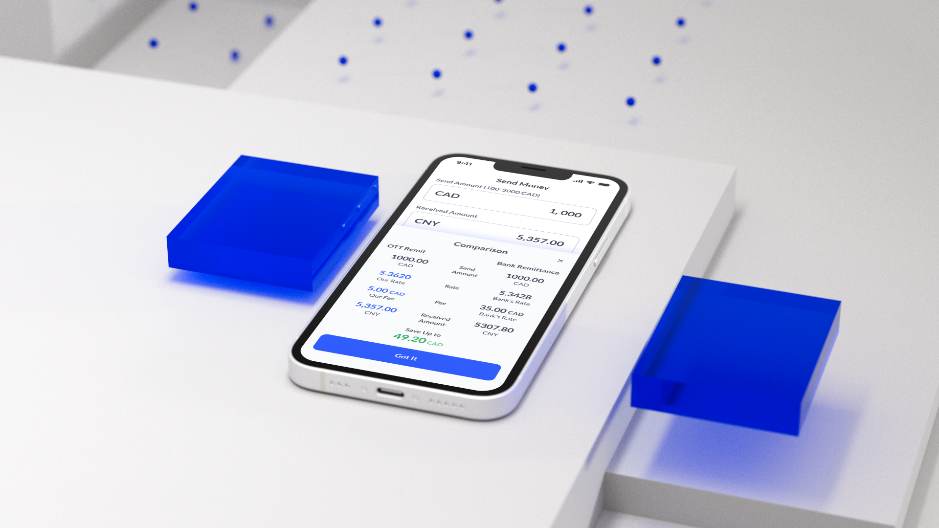
Final Mockup Presentaion
Problem
1. Traditional bank wire transfers require filling out complex forms, with expensive fees and necessitate visiting offline bank branches, which is time-consuming.
2. In China, recipients more commonly use WeChat and Alipay as their receiving accounts rather than traditional bank accounts. Currently, in Canada, there are no direct remittance tools to transfer funds to WeChat or Alipay.
3. Many people, in the desire for better exchange rates than those offered by banks, turn to private individuals for currency exchange, often falling prey to scams where their funds are taken away, and the security of their funds is not guaranteed.
Limit
Regulatory Compliance
International remittances are subject to regulatory restrictions, especially regarding amounts and the KYC (Know Your Customer) collection of user information. This may cause inconvenience for new users during the registration process.
Goal
1. Create an online solution that allows users to quickly complete the entire process of transferring money from Canada to China anytime, anywhere.
2. The entire remittance process must be user-friendly and easy to understand, aiming to simplify the steps as much as possible.
3. Provide information related to exchange costs, aiming to minimize the remittance costs for users as much as possible.
4. Support receiving funds into WeChat Pay and Alipay accounts.
5. The app's design should make users feel that the remittance process is secure.
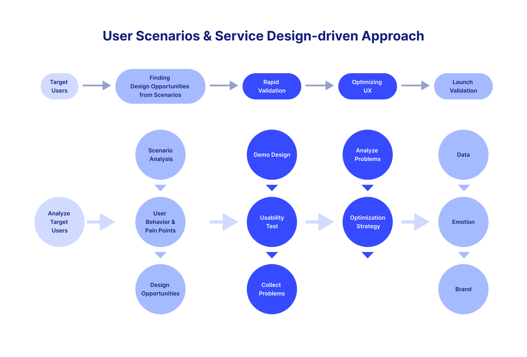
Design Method
Throughout the entire design process of the remittance project, we consistently followed a user scenario and service design-driven approach. This involved analyzing target users, uncovering design opportunities from these scenarios, rapidly validating design solutions, identifying issues, optimizing the experience, and ultimately launching and promoting the product.
Quantitative Research
Quantitative Research Plan
1. Survey Creation: Develop an online survey using Google Forms.
2. Objective: To understand the demographic, remittance behavior, technological adoption, and application preferences of Chinese immigrants in Canada.
3. Participant Selection: Utilize the customer base accumulated by the internal foreign exchange department of the company. Targeting 50 Chinese immigrants across different age groups, education levels, and regions.
4. Survey Questions: Create a comprehensive online survey using a mix of multiple-choice, Likert scale, and open-ended questions.
a. Demographic Information: Gather data on age, gender, and education level.
b. Remittance Behavior: Explore the frequency of remittance, preferred methods, average amounts sent, and satisfaction levels with existing services.
c. Technology Adoption: Assess smartphone usage, comfort level with financial apps, and preferred payment methods.
d. App Preferences: Investigate the importance of various app features like security, ease of use, fees, multilingual support, and speed of transactions.
5. Distribution and Analysis: Share the survey through the company's internal customer group and analyze quantitative data using Excel. Extract and analyze key patterns and preferences.
Result & Insights
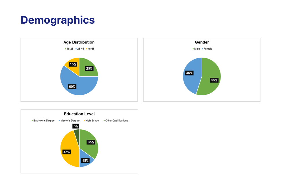
1. The user age group is mainly concentrated between 30 to 45 years old, comprising middle-aged immigrants who may not be very familiar with the Internet. Gender distribution is almost equal between males and females.
2. The educational level of the user group is predominantly high school and graduate, leaning towards the medium to lower range. They may face challenges in completing overly complex remittance tasks.
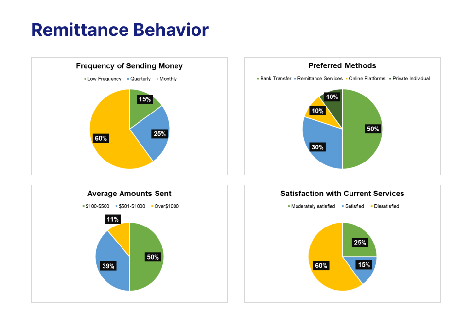
1. The highest number of individuals prefer a monthly remittance cycle.
2. The majority of users remit small amounts, typically below 1000 Canadian dollars.
3. The satisfaction with current currency exchange methods is only 15%, indicating there is room for improvement in the existing remittance services.
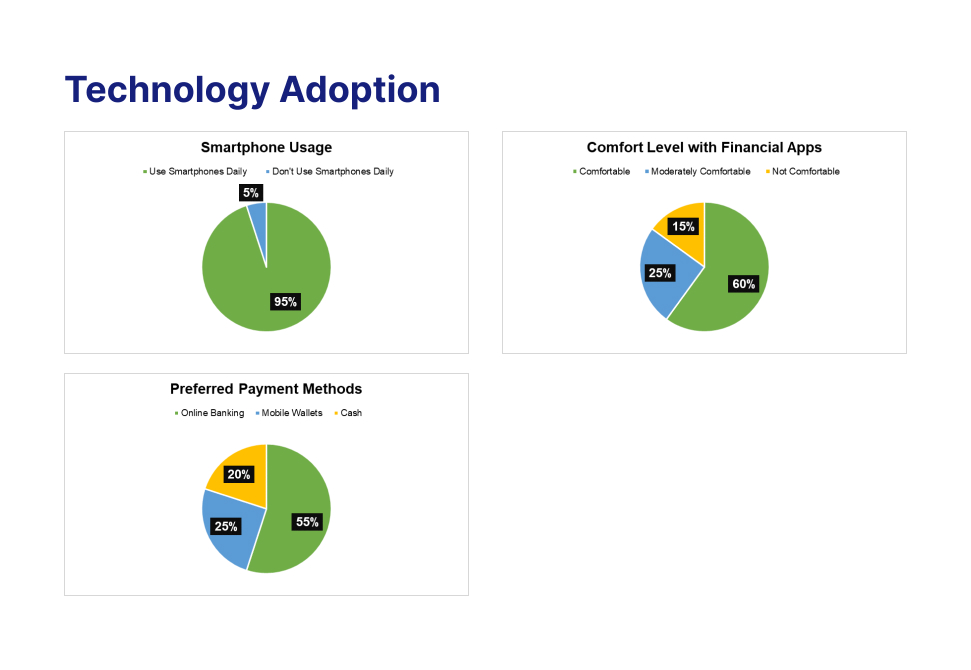
1. 95% of users use their smartphones every day.
2. There is a high acceptance of financial apps among users.
3. Online digital transfers (E-transfer) are quite prevalent.
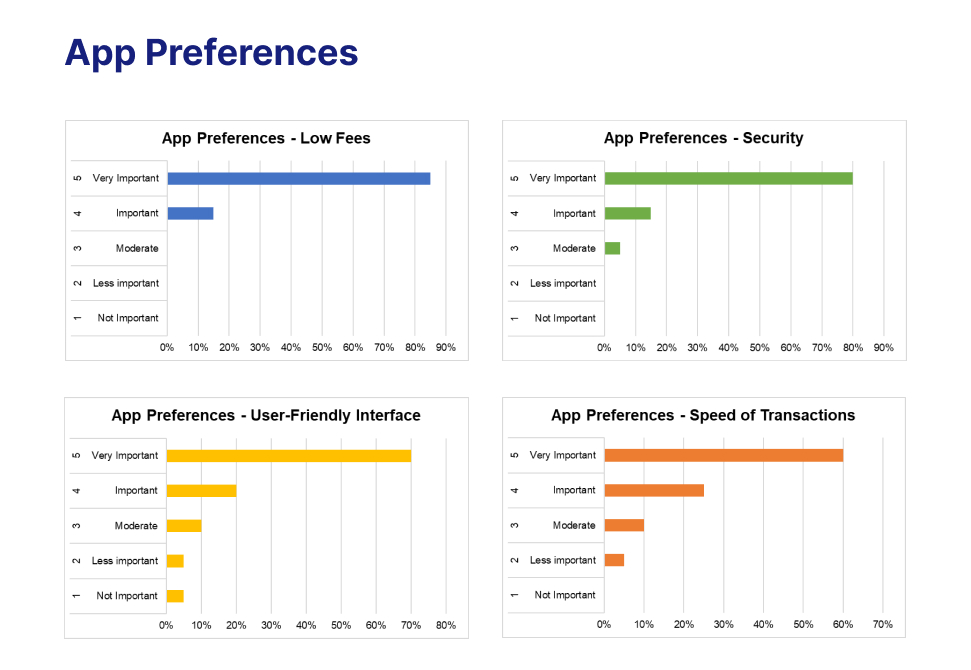
1. The users consider the following factors to be the most important for a remittance app:
Low fees
Security
User-friendly interface and user experience
Speed of remittance processing
Qualitative Research
Method: In-Depth Interviews
1. Interview Structure:
a. Current Remittance Process: Explore participants' experiences with existing remittance services, including the steps involved, platforms used, and overall satisfaction.
b. Challenges Encountered: Identify specific challenges, pain points, and frustrations encountered during the remittance process.
c. Suggestions for Improvement: Seek participants' suggestions and ideas for enhancing the user experience and overcoming the identified challenges.
2. Observational Studies:
a. Observe participants as they perform specific remittance tasks, such as initiating a transaction, verifying information, or tracking a transfer.
b. Document any hesitations, difficulties, or moments of confusion.
3. Analysis:
a. Transcribe and analyze interviews, identifying common themes, pain points, and desires.
b. Extract insights regarding user behaviours, cultural considerations, and expectations from the current remittance method.
Key Insights
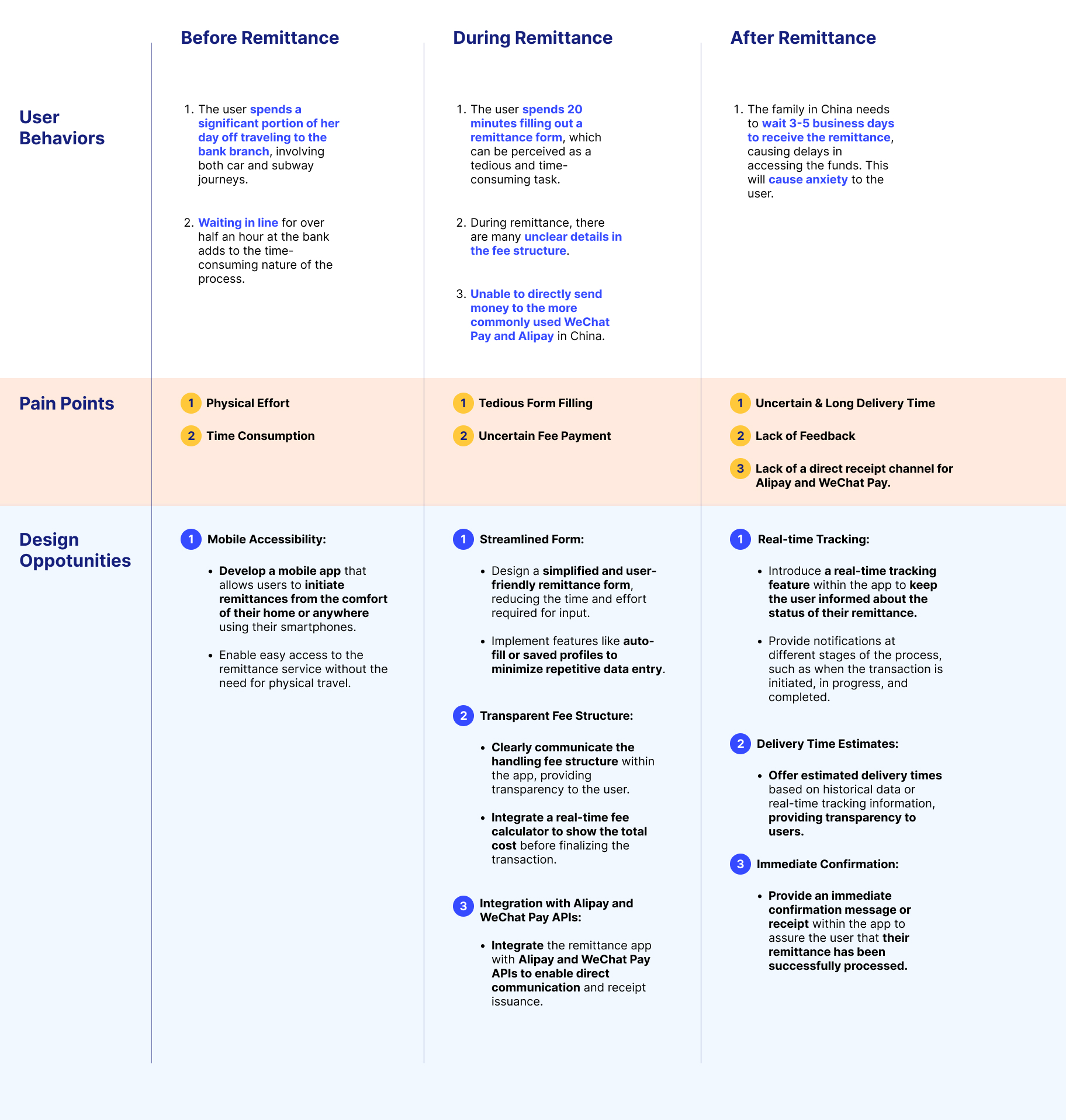
1. Confusing Fee Structures: Participants found it challenging to understand the fee structures of remittance services, leading to uncertainty about the total cost of transactions.
2. Exchange Rate Ambiguity: Users expressed frustration with unclear information about exchange rates and the impact on the amount received by recipients.
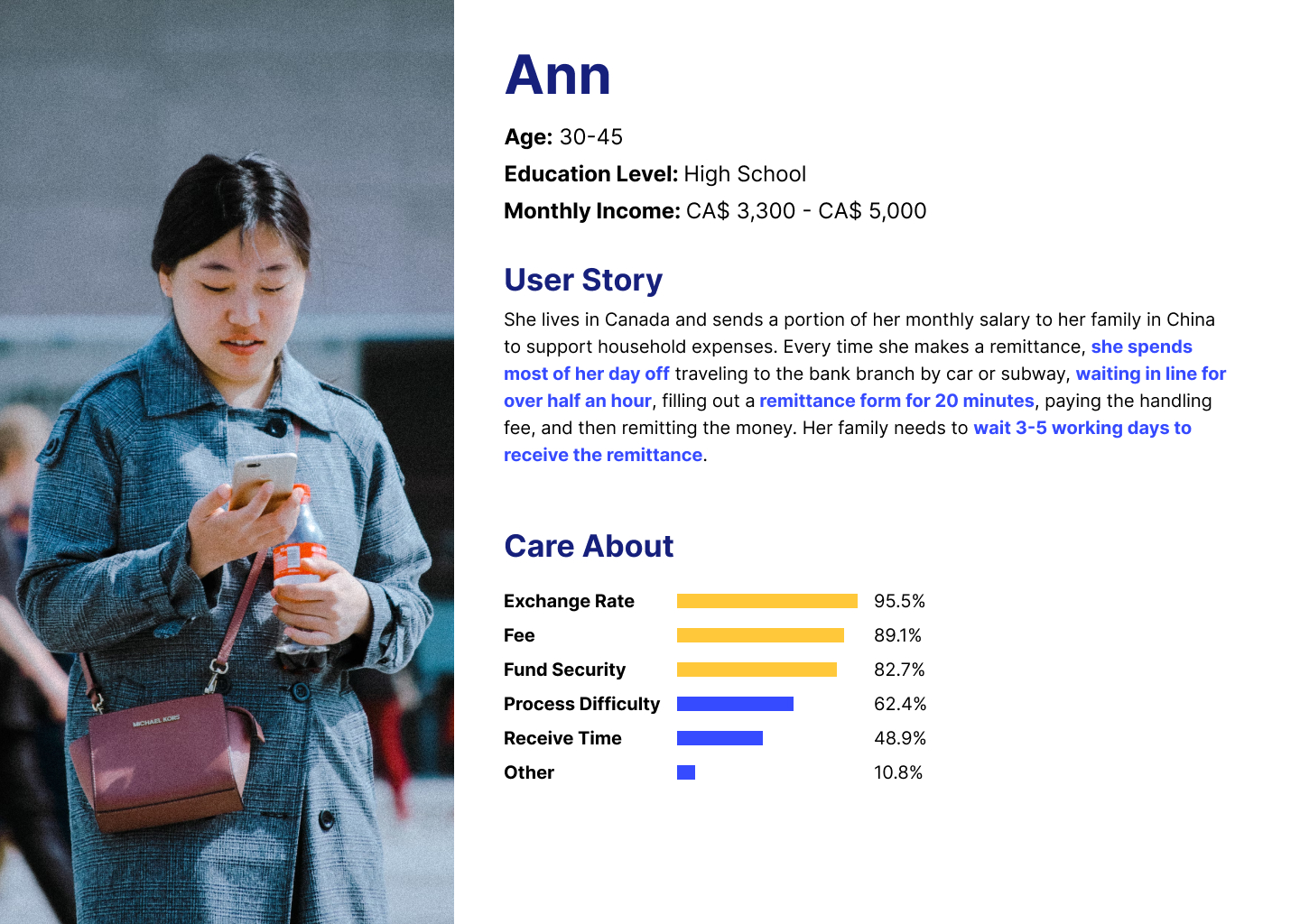
Analyze Target Users
Based on a comprehensive questionnaire survey and multiple interviews with the target users, we have analyzed the user profile:
The target audience is approximately between 30-45 years old, with a basic monthly salary of around 3500 CAD. They have a moderate to low income, are budget-conscious, have a moderate to low level of education, and are not familiar with new internet products. They are most concerned about remittance costs, fund security, ease of operation, and remittance speed.
Analyze The Scenario
Clearly Defining the Constraints of Regulatory Compliance
Registering a new account with a financial institution is a cumbersome process. During the account opening, users are required to fill out numerous forms and provide documentation to comply with the KYC (Know Your Customer) regulatory requirements of the compliance department. Therefore, clearly defining the boundaries of regulatory compliance is an essential step before starting this project.
Based on the previous user research, our target users primarily engage in small-scale currency exchange and remittance transactions, with amounts not exceeding 5000 Canadian dollars.
After discussions with the compliance department, we have arrived at a balanced approach: Since we focus on small-scale remittances, some of the KYC user information can be streamlined.
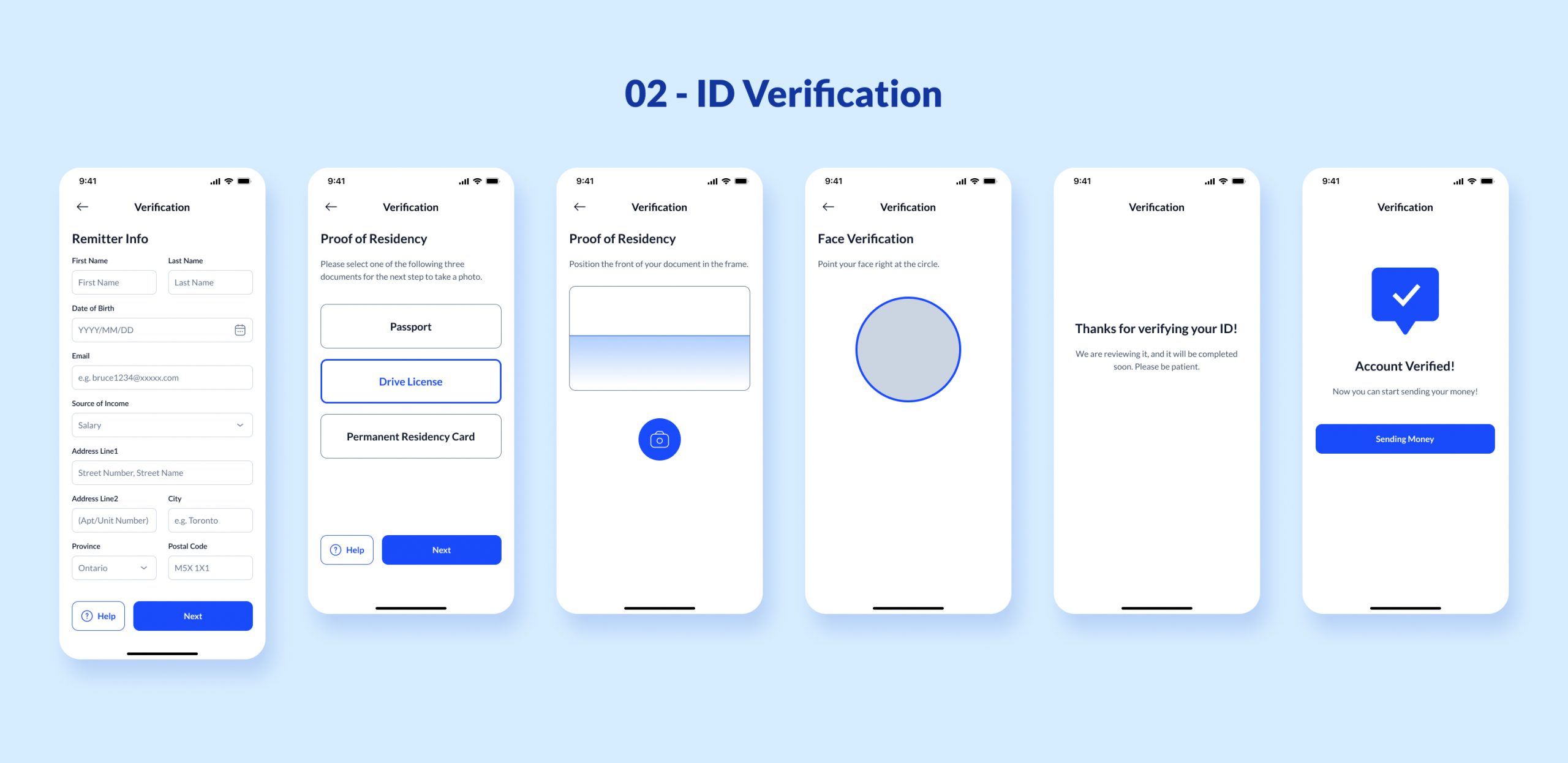
Therefore, in collaboration with the compliance department, we retained only the necessary KYC information required by regulations. Unnecessary form fields were removed to minimize the steps for user account opening. The final required KYC information includes:
Full Name
Address
Photo ID scan (Driver's license, passport, or PR card, choose one)
Facial recognition
Source of income
Solution
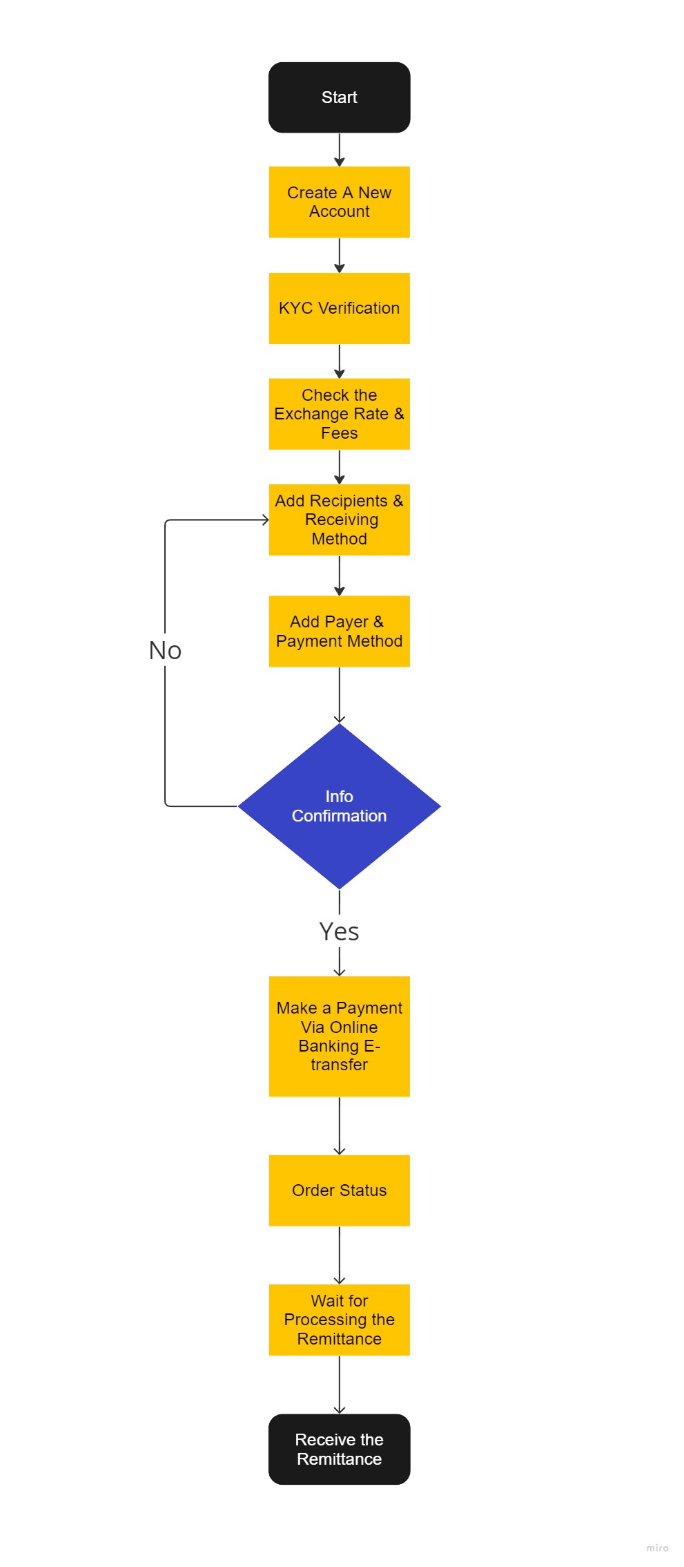
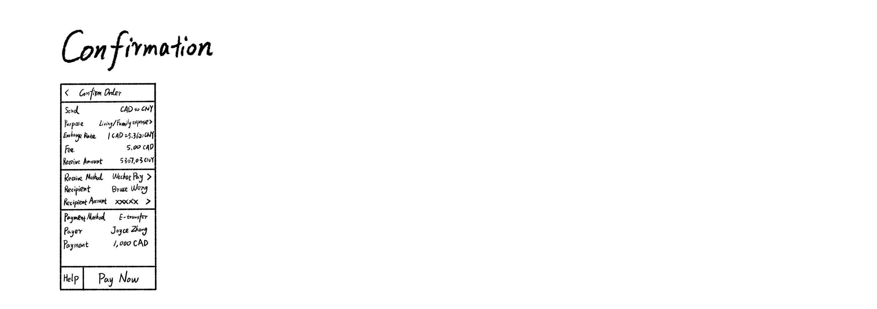
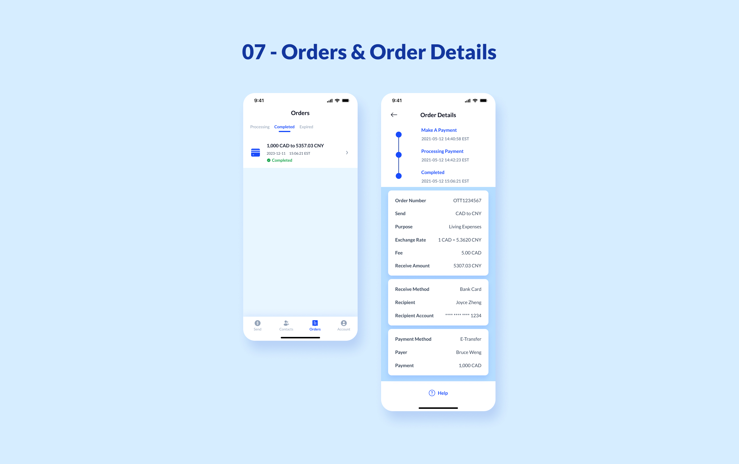
Based on research into user scenarios and collaboration with the currency exchange department, the following is a summarized remittance product solution:
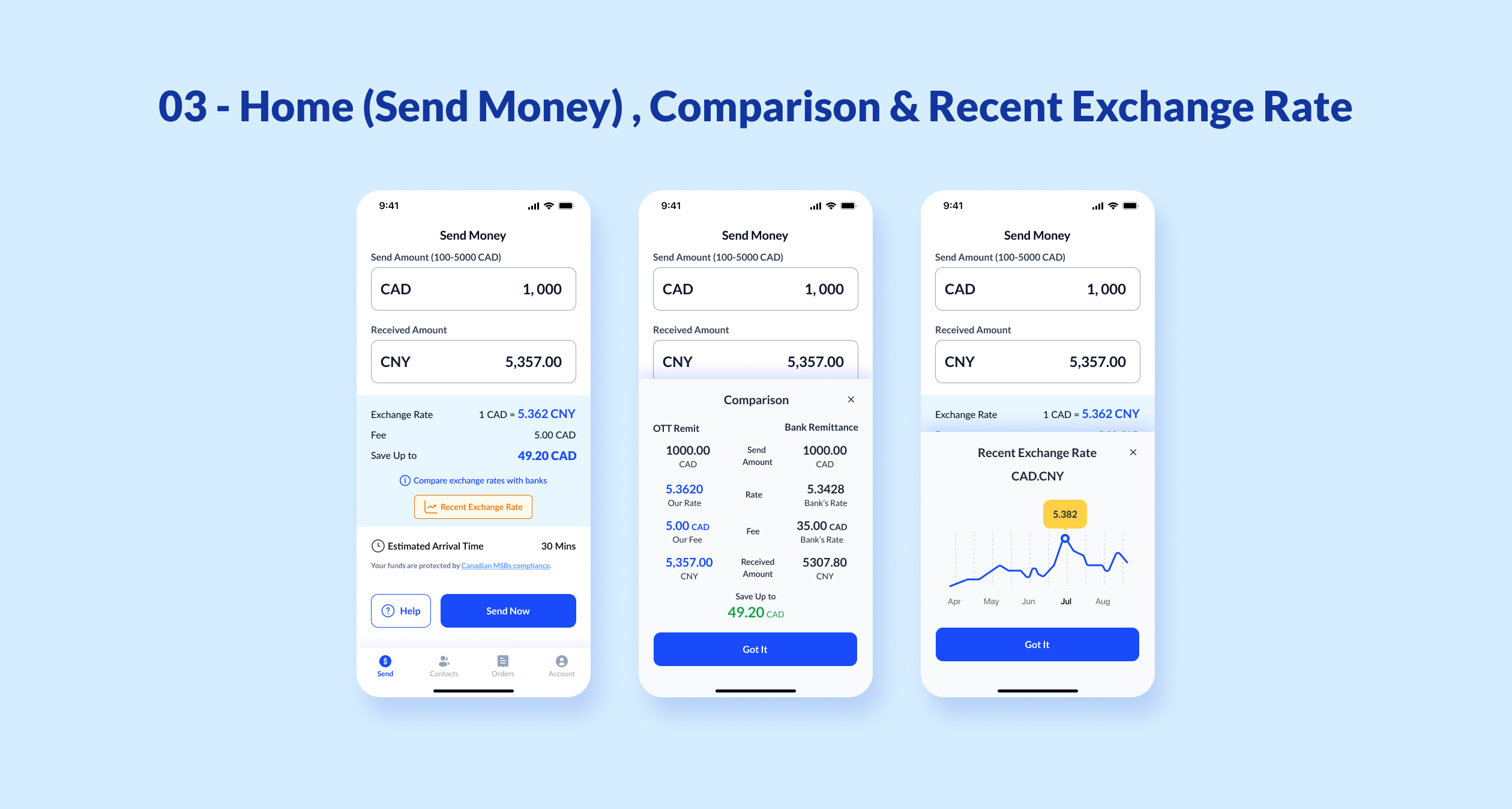
1. View exchange rates and fees.
2. Register a new account (if no account exists).
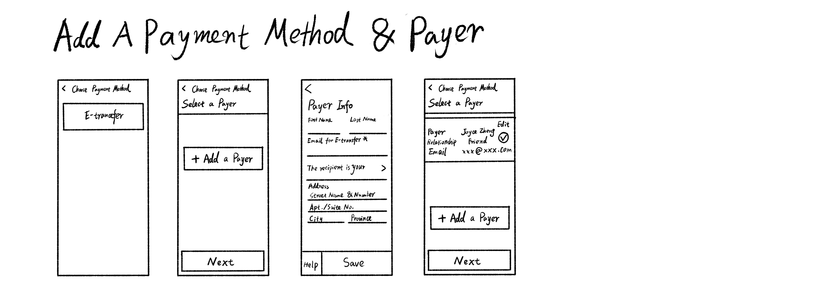
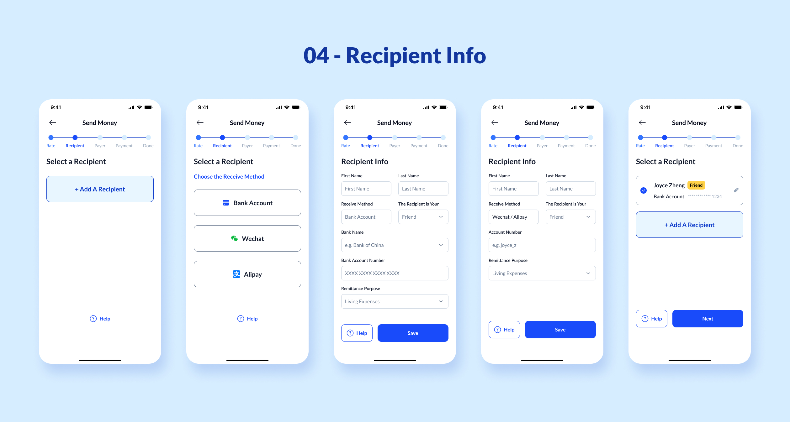
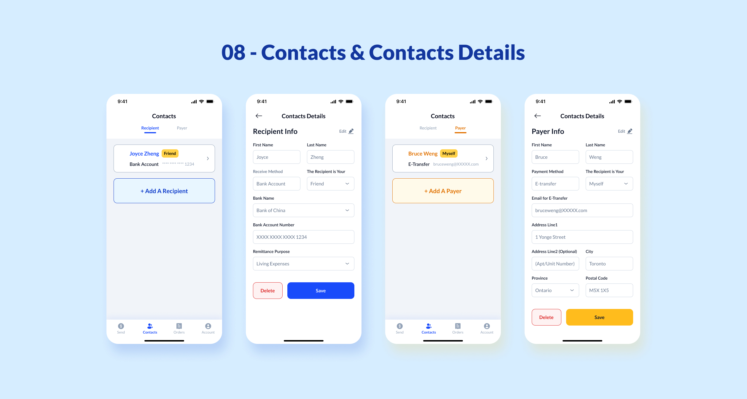
3. Add recipients and receive method (including bank account and WeChat Pay/Alipay).
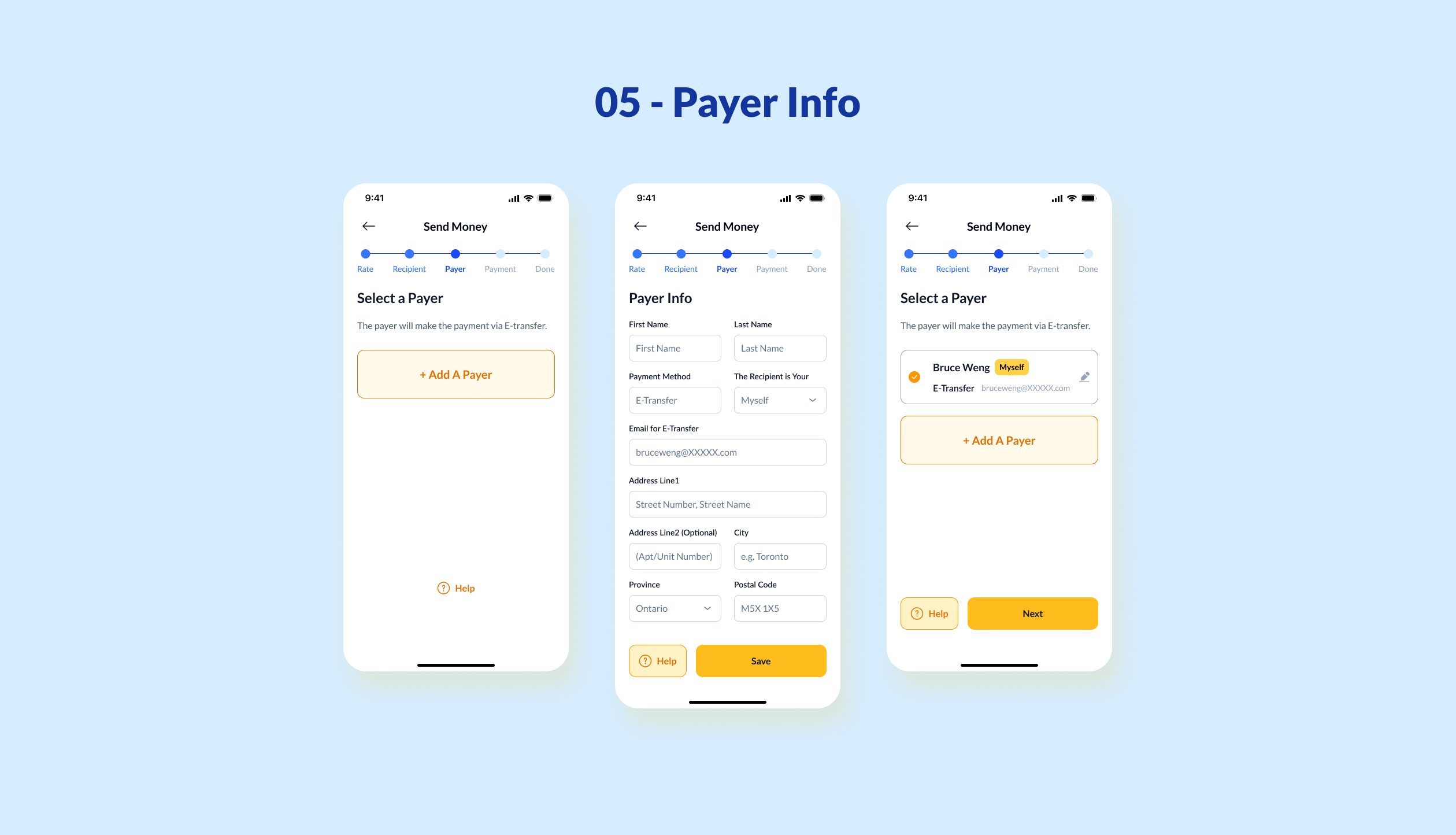
4. Add payer and payment method.
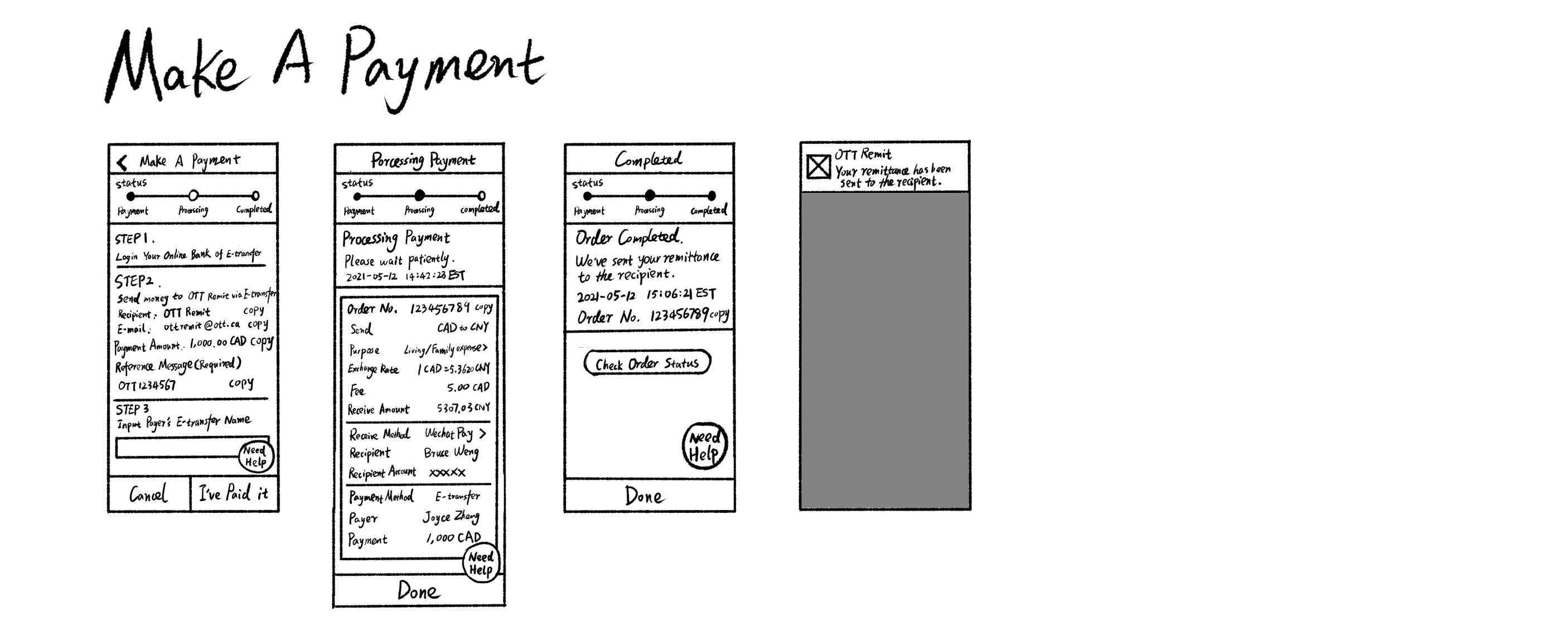
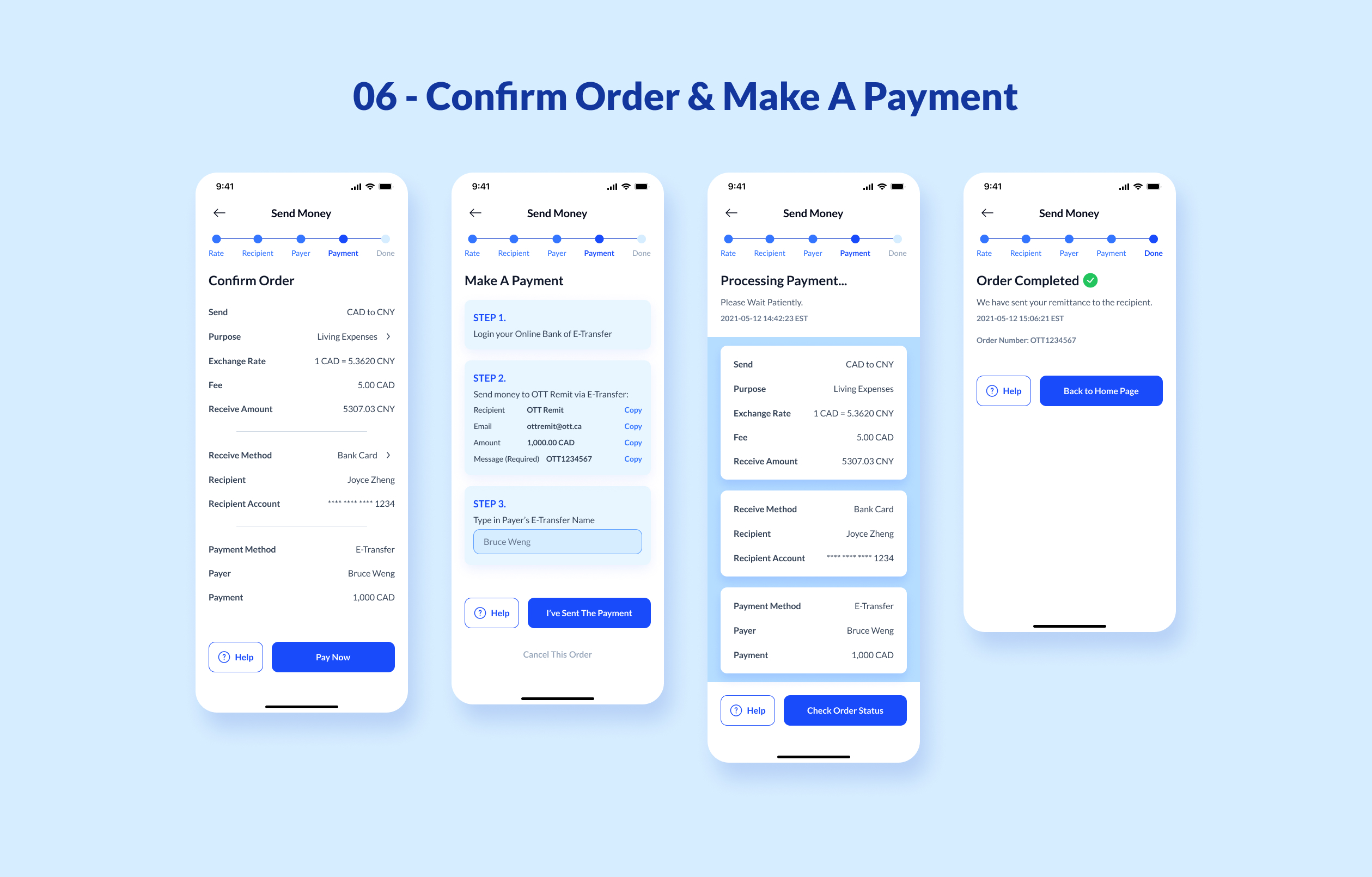
5. Initiate transfer.
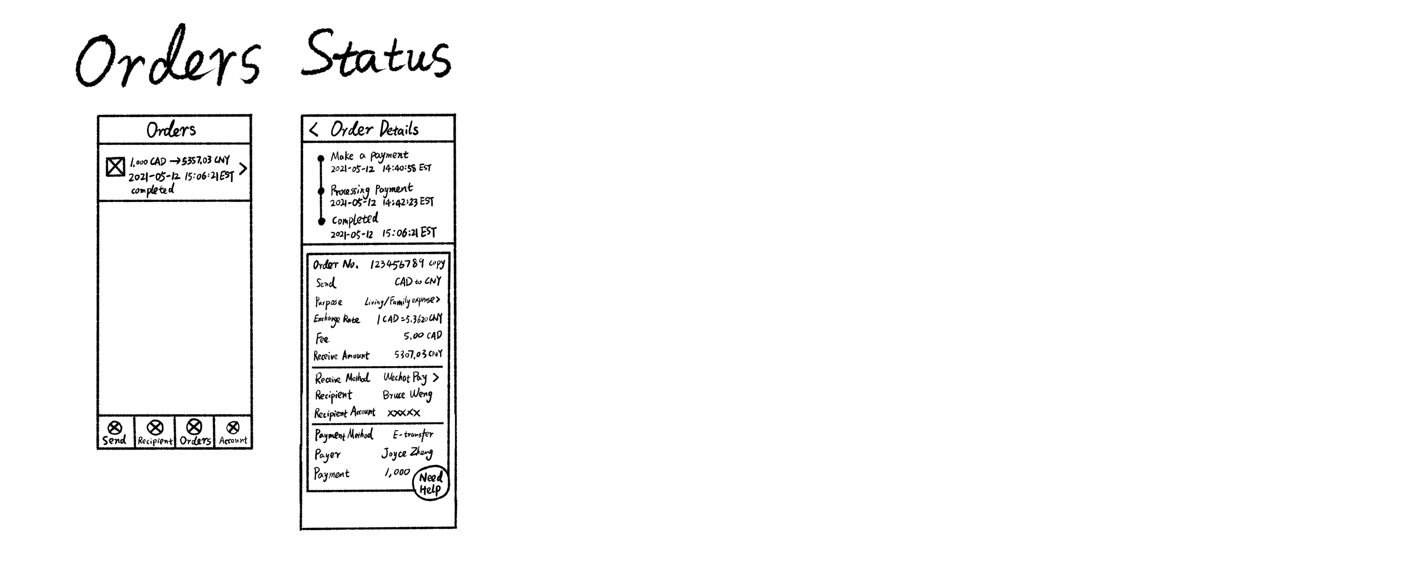
6. Wait for the transfer to complete (within 30 minutes).
7. Complete the transfer.
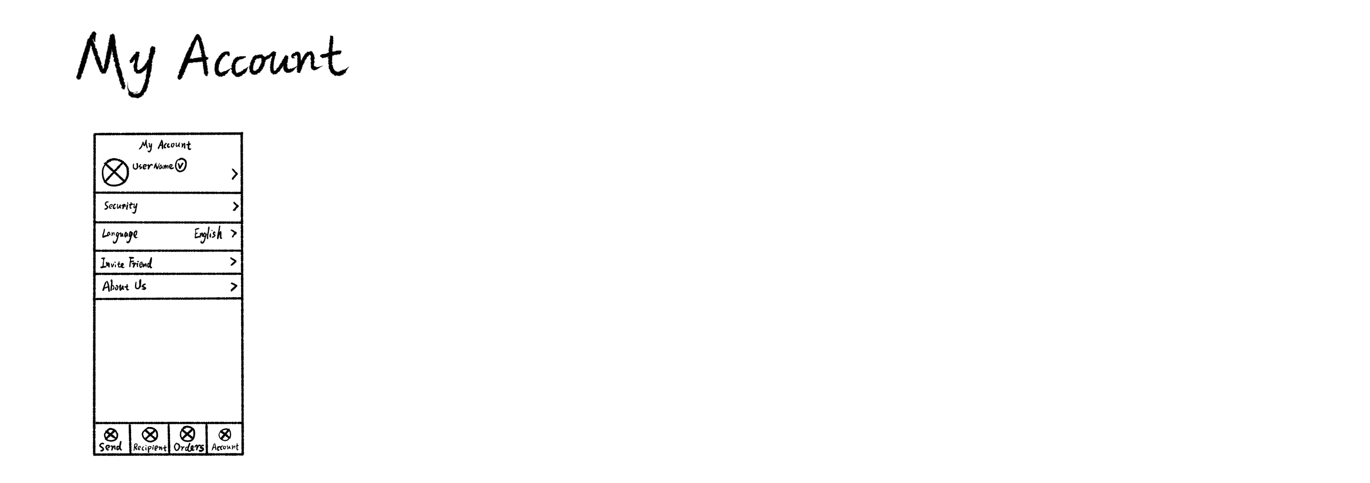
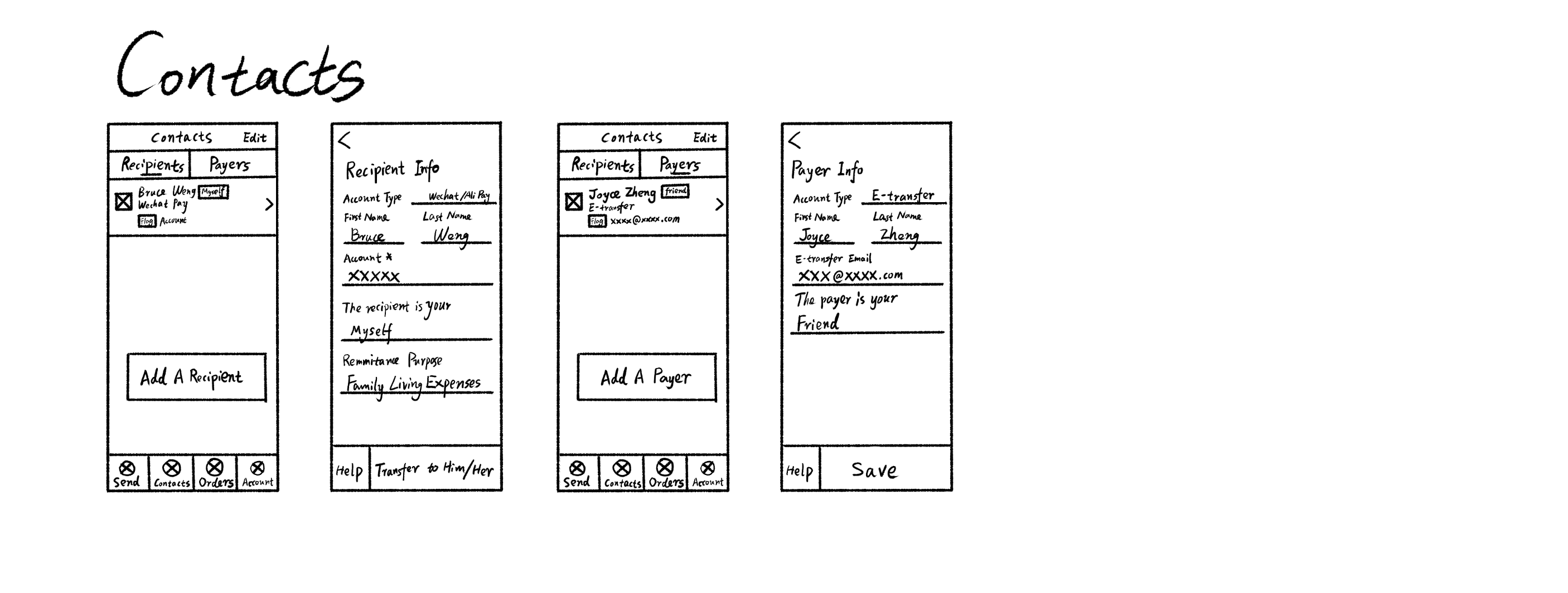
Demo Wireframe Sketch
After finalizing the product solution, I created a demo wireframe prototype that highlights a streamlined process, concise forms, and real-time feedback during the design phase.
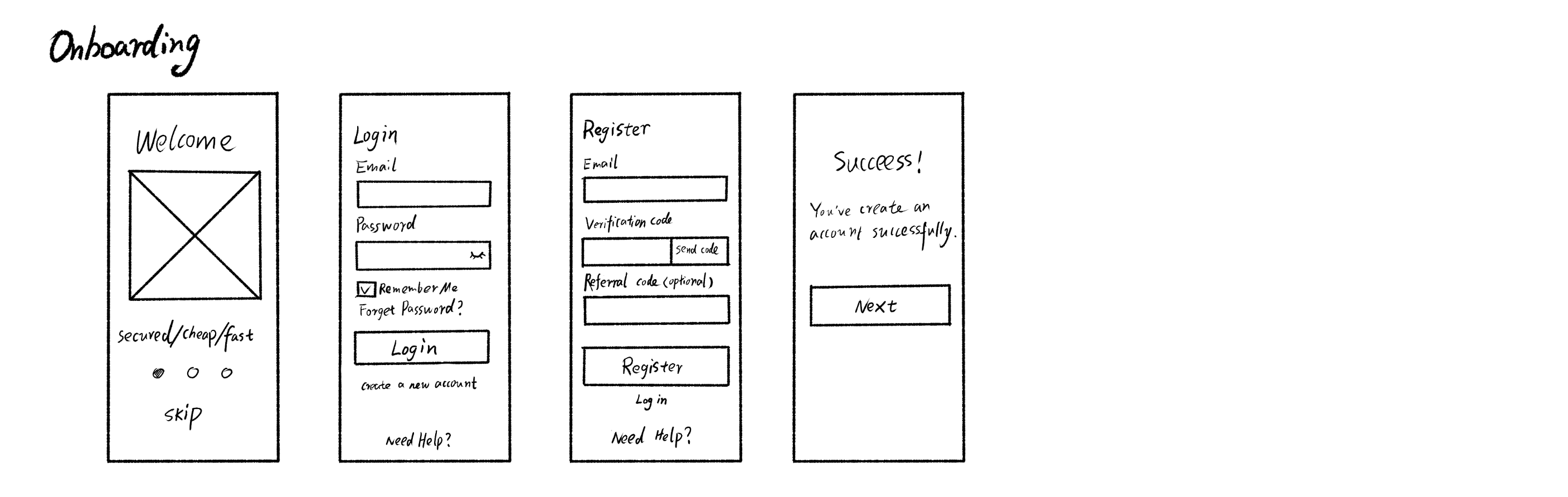
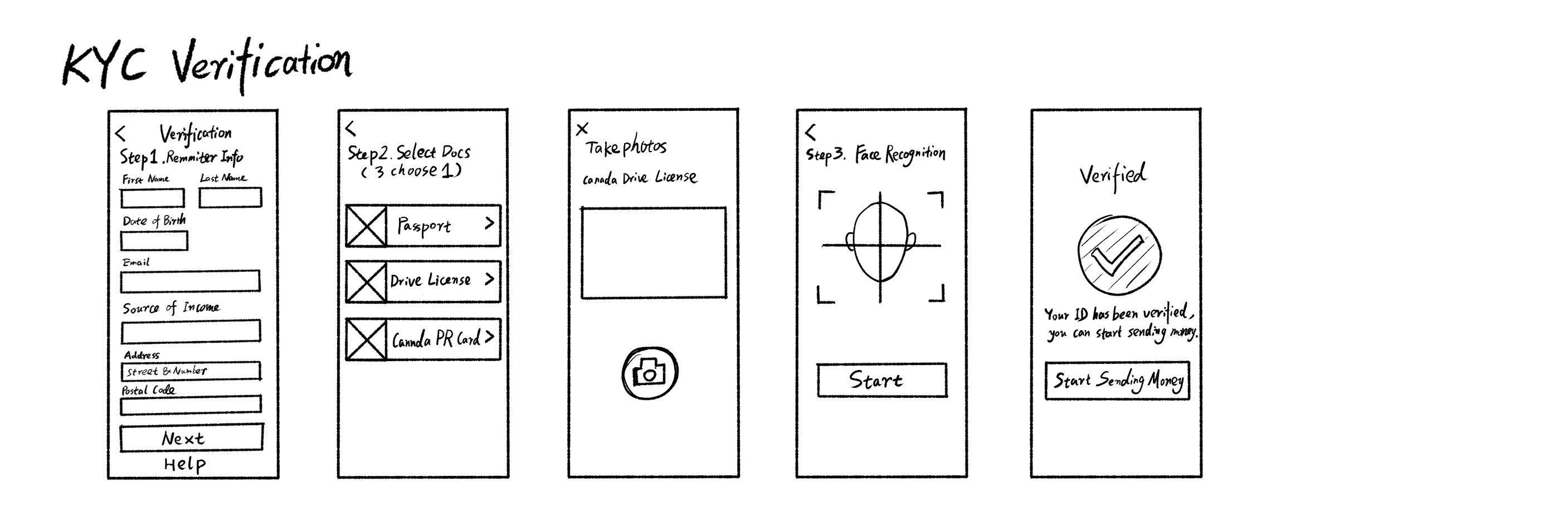
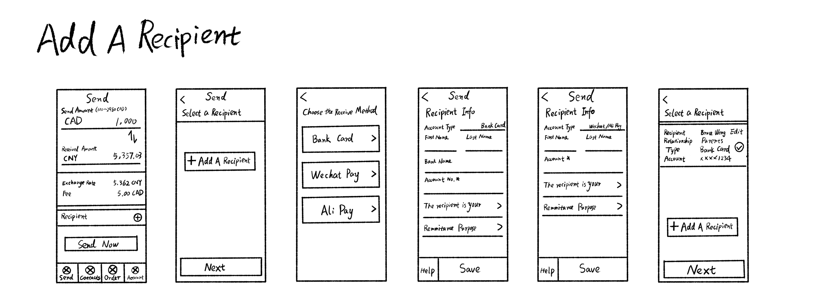
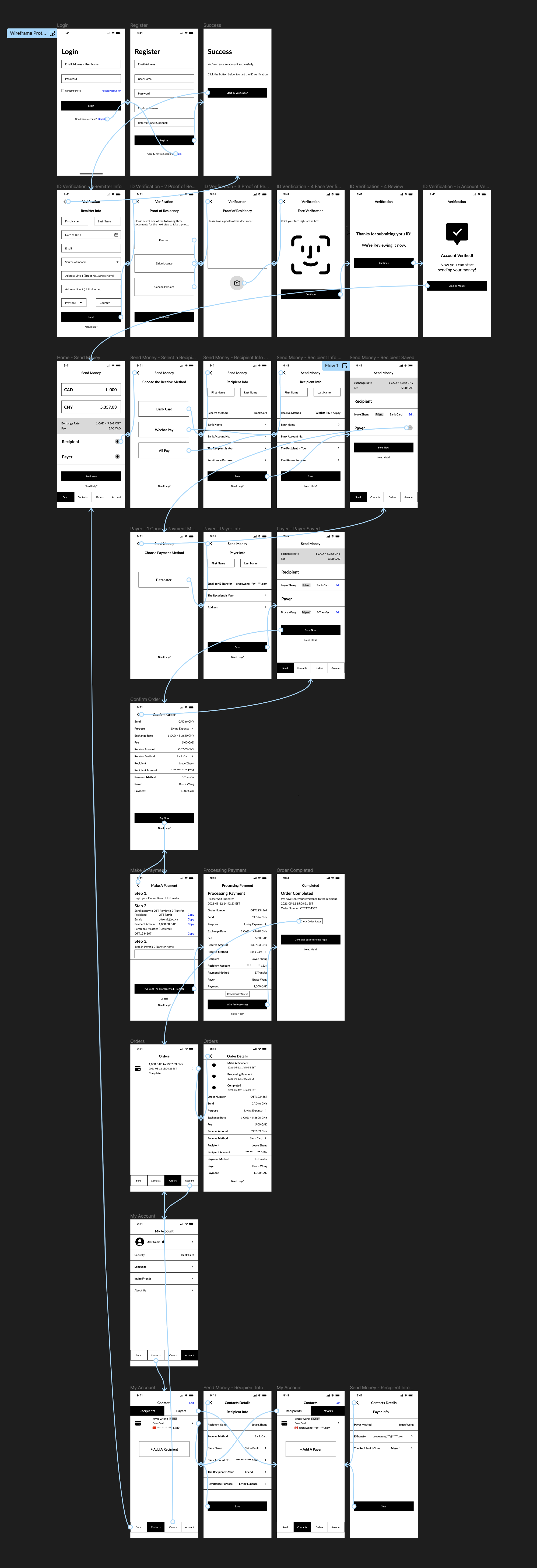
Wireframe Prototype
With a deeper understanding of the app's architecture and processes, I designed the mid-fidelity wireframes for the app using Figma and created the interactive flow. These mid-fidelity wireframes will be used in the first round of user usability testing to gather feedback.
Usability Test 1
We handed over the interactive wireframe prototype to users for the first round of usability testing. The goal of this prototype is to simulate key tasks such as account registration, identity verification, adding recipients & payers, and completing remittances. This usability study is intended to help me gain a deeper understanding of qualitative research information.
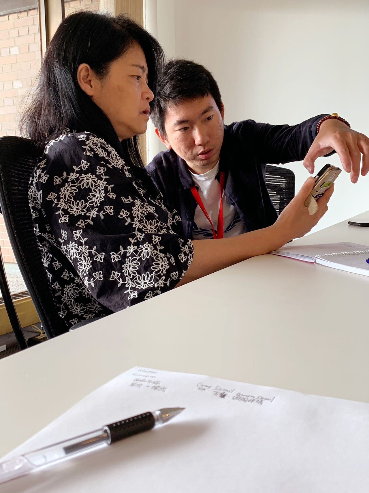
We recruited 10 target customers—Chinese immigrants from our company's client base—for usability testing with the prototype. We observed their ability to complete the registration and remittance tasks.
Usability Test Plan
Participants: 10 people between the ages of 30 and 45 years old
UX Metrics: Task Success Rate, Time-on-Task, Error Occurrence Rate
Research Goals
1. Determine if users can complete core tasks within the app.
2. Find out how usable and useful the product is to users.
Research Questions
1. What can we learn from the user flow, or the steps that users take, to figure out if a product is user-friendly
2. Are there parts of the user flow where participants get stuck?
3. Are there design changes we can make to improve the user experience with the app?
4. How long does it take a user to complete the main tasks?
5. Do users think the app is easy or difficult to use?
Tasks
1. Create an account on the app.
2. Complete KYC verification
3. Check the Exchange Rate & Fees
4. Add Receiving Method and Recipients Info
5. Add Payment Method and Payer Info
6. Make a Payment Via Online Banking E-transfer
7. Check Order Status
8. Check Account Setting
Result
Surprisingly, out of the 10 target users, only 2 were able to complete the remittance task without assistance during the 1-hour session.
Collect Problems (Key Findings)
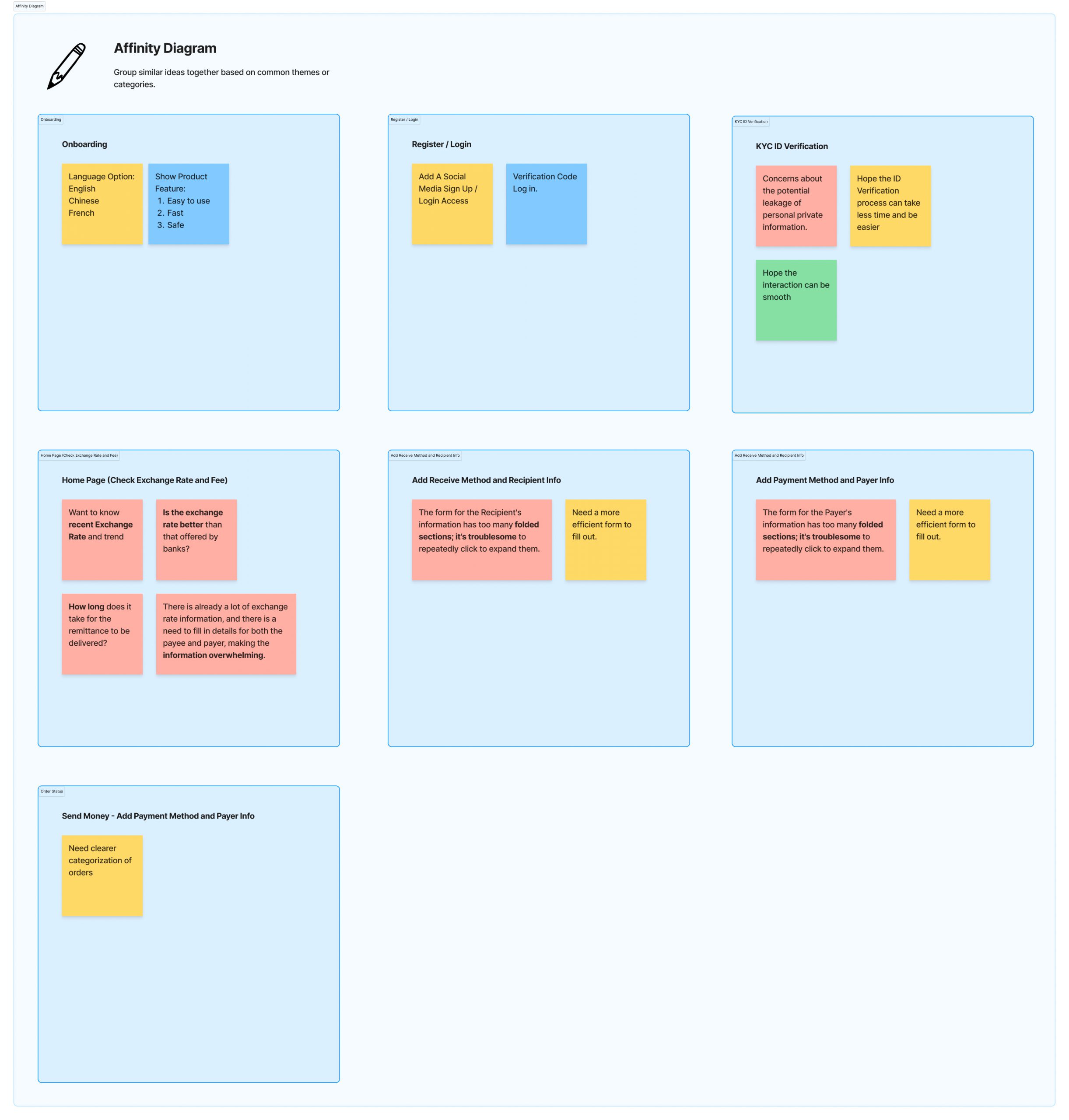
By creating an Affinity Diagram of our observations, we collected some problems from the usability test.
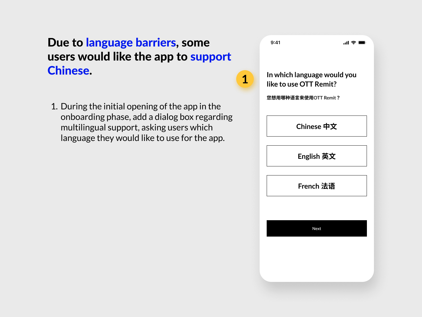
1. Needs support for multilingualism in Chinese, English, and French (Some Chinese immigrants are not proficient in English or French and would like native language support).
2. Difficulty in navigating the homepage due to excessive information.
3. Concerns about the potential leakage of personal information.
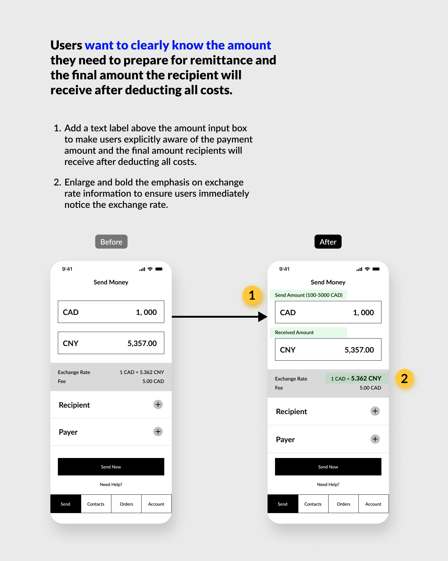
4. Desire for more information about exchange rates and fees.
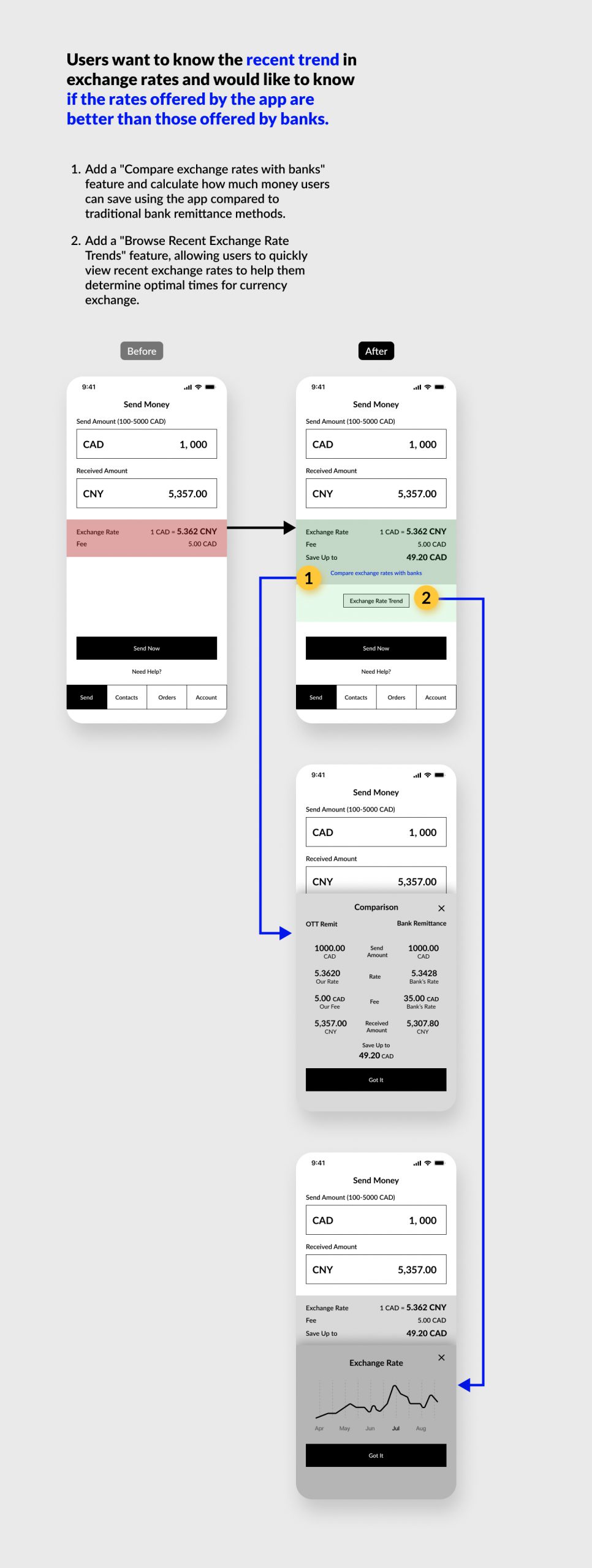
5. Interest in knowing if the product's exchange rates are better than those offered by banks.
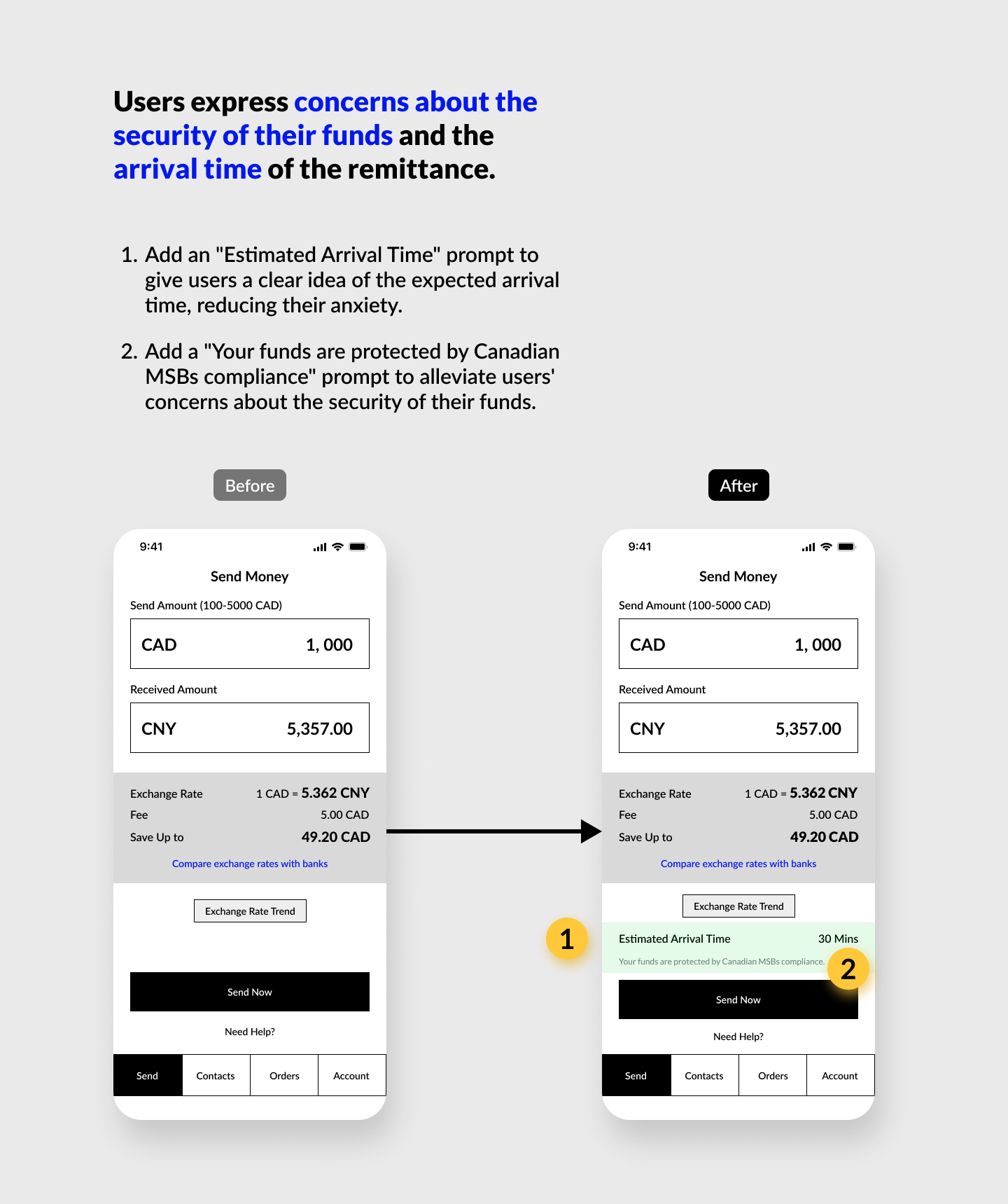
6. Concerns about the security of funds during the remittance process.
7. Uncertainty in filling out forms and interacting with controls for payee and payer details.
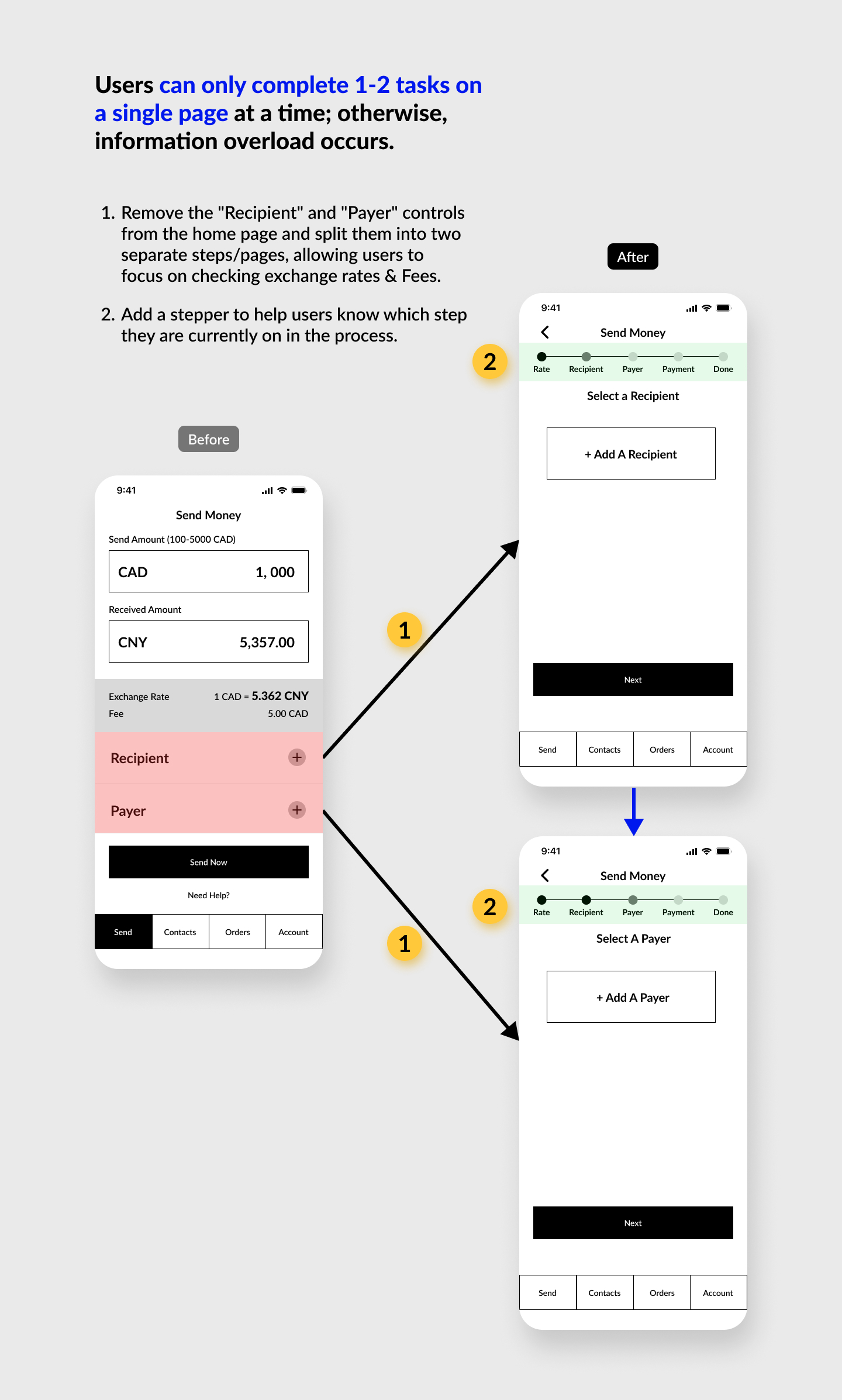
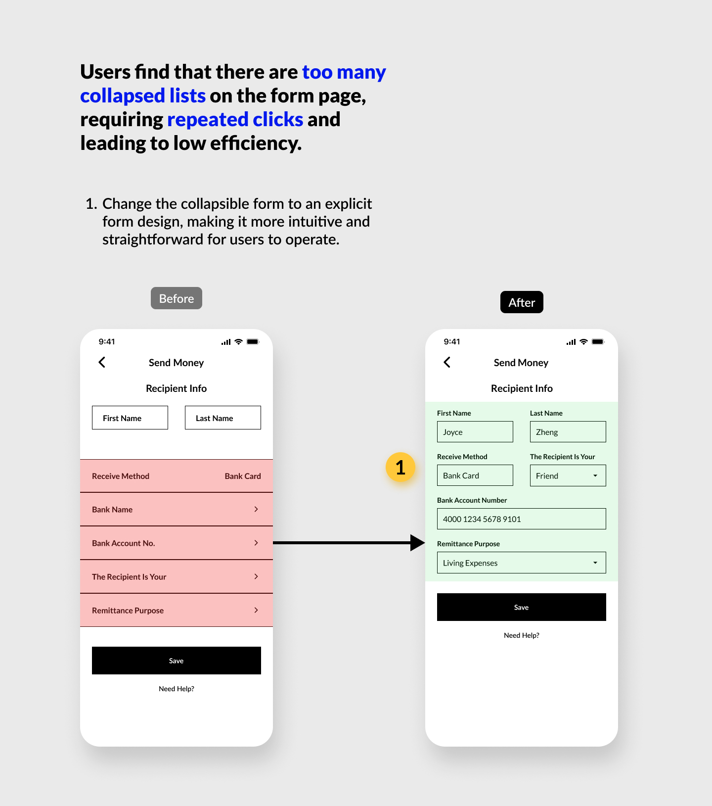
8. Frustration with the numerous collapsed lists on the form page, leading to low efficiency.
9. Ignoring or not understanding information and notes.
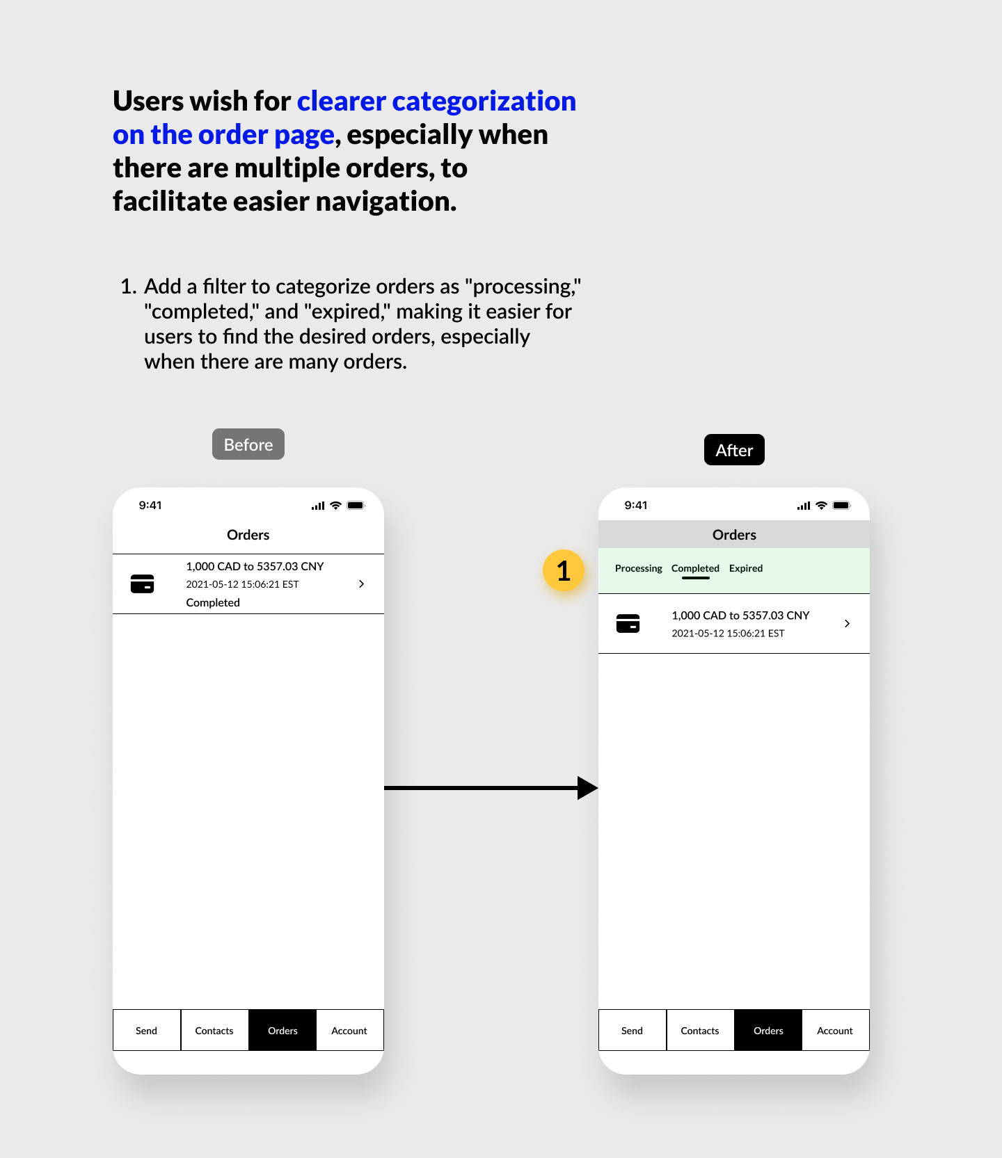
10. Users express a need for better categorization on the order page.
Optimized Strategies
Design System
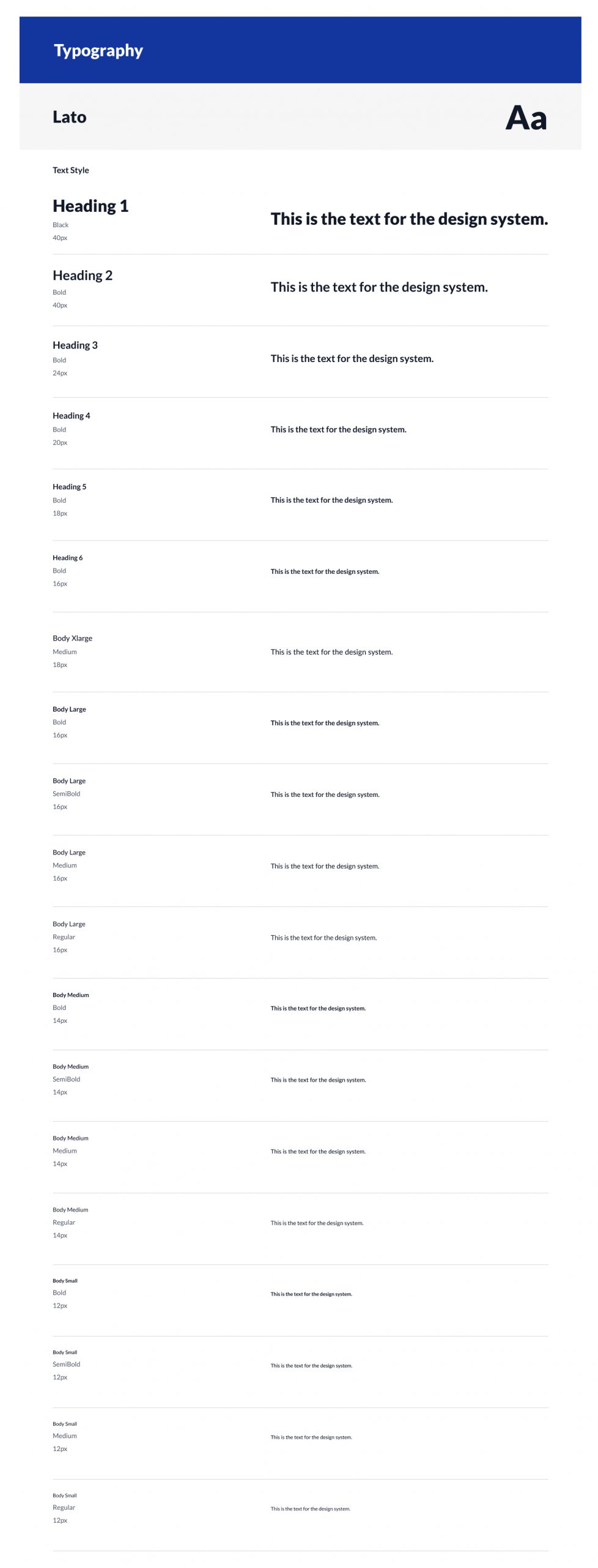
Typography:
I chose the Lato font for the OTT Remit app because, in a financial app like OTT Remit, numbers are a crucial element. The Lato font performs well in displaying numbers, providing clarity with its high x-height (the height of the lowercase letter x). This ensures clear visibility of numbers, especially in small font sizes. This is particularly important for a financial app, where users need to have a clear view and understanding of numerical information related to amounts and exchange rates. Additionally, the Lato font emphasizes readability and a modern feel in its design, contributing to an enhanced overall appearance and user experience of the user interface.
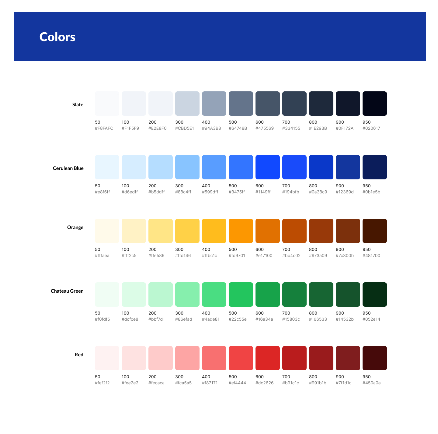
Colors:
I used the standard colors from Tailwind CSS for all color grading. The color scheme of the OTT Remit app continues its logo with blue and orange. Blue is a common color used in corporate settings, providing a stable, calm, and trustworthy mood, contributing to building a stable and secure brand image for OTT Remit. For the rest, I primarily used white to give the application a clean visual style. For some parts that need emphasis, I used the complementary color of blue, orange, to enhance the visual focus. Additionally, I used blue and orange (Complementary colors) to represent the recipient and payer, making it easier for users to distinguish between these two roles when filling out forms. Finally, I used green and red to highlight special information.
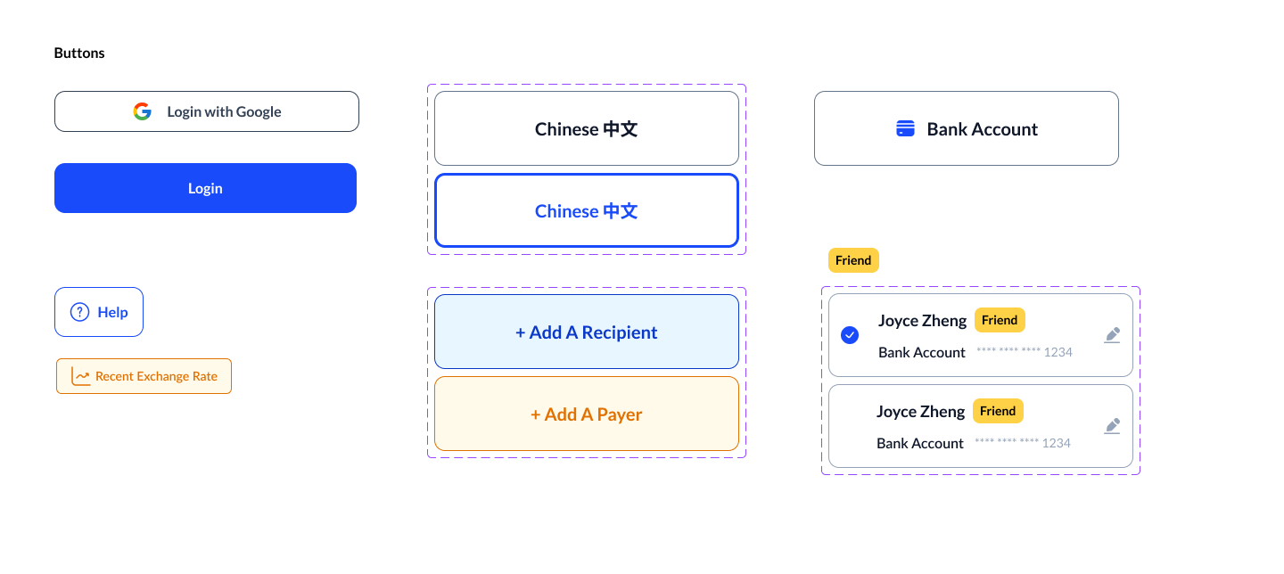
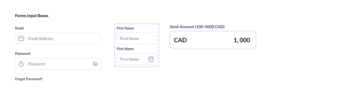
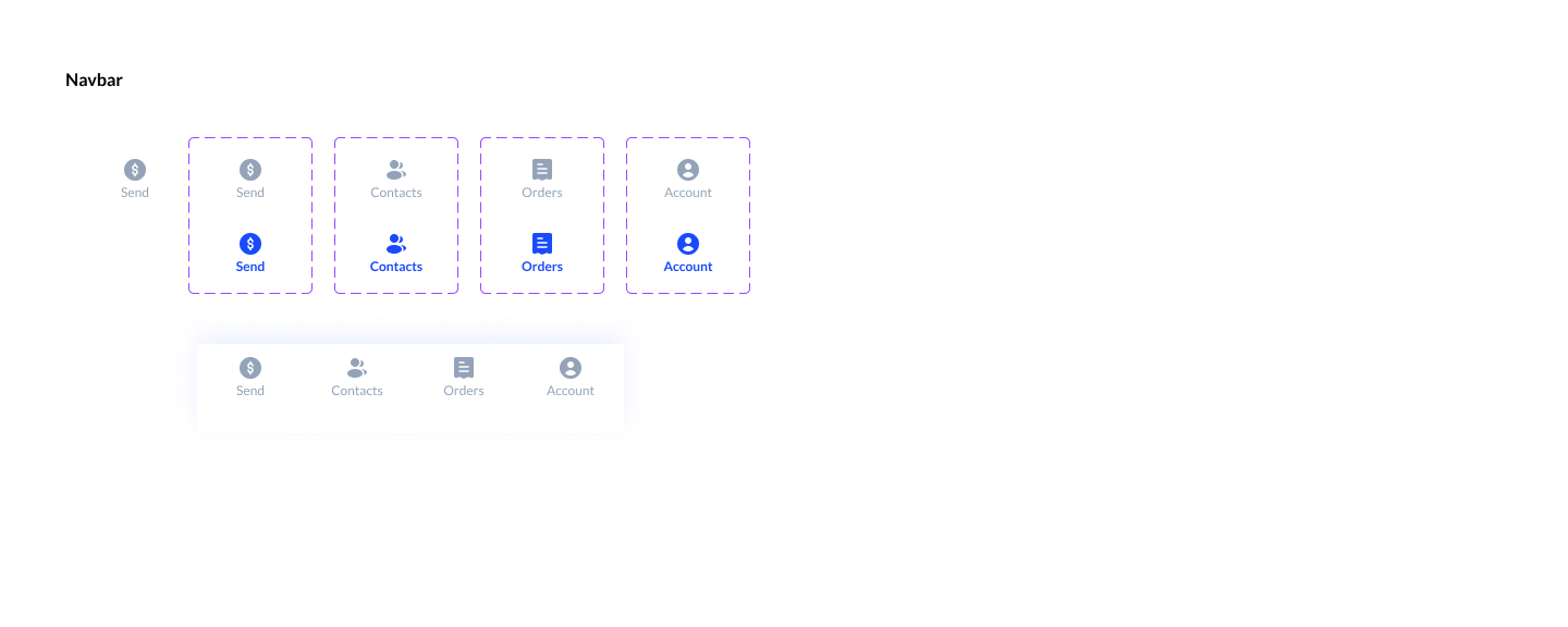
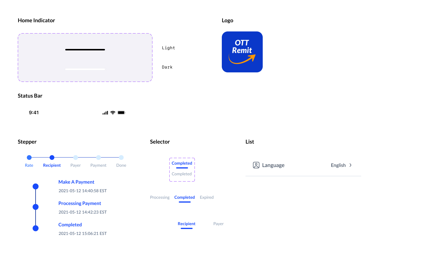
Components:
Final UI Design
Usability Test 2
Validating Design Changes
After finalizing the interface design of the app, I created a high-fidelity prototype in Figma that closely resembles the final product. I conducted another round of usability test to validate the design changes made in the prototype.
Research Goals
1. Find out if the new design changes properly address users’ pain points.
2. Determine if users can easily complete core tasks within the app.
Research questions
1. Do the new design modifications properly address users’ pain points?
2. Are there parts of the user flow where participants get stuck?
3. Are there design changes we can make to improve the user experience with the app?
4. How long does it take a user to complete the main tasks?
5. Do the visual elements in the app support the users in navigating through the app?
Key Findings and Insights:
1. The design adjustments I made successfully addressed user pain points, significantly reducing their task time and confusion about the app's features.
2. Users are satisfied with the addition of Chinese language support.
3. Users are highly satisfied with the "Compare exchange rates with banks" and "Recent exchange rate trends" features on the homepage, providing clear information on the competitive rates and fees offered by OTT Remit, enhancing user satisfaction.
4. The new design of the app, along with UX feedback and updated UI, has increased users' trust in the OTT Remit App, reducing concerns about fund security.
5. After separating recipient and sender information, users are less distracted on the homepage, allowing the majority to focus on exchange rates.
6. Most users (80%) understand the meaning of the STEPPER showing steps and can smoothly complete each task page step by step.
7. All users appreciate the explicit form design, reducing the complexity of the previous collapsible forms.
8. The majority of users are satisfied with the new UI design and appreciate the clean and simple aesthetic.
Outcome
Increased 200 new users for remittances within one month of product launch.
A 20% increase in overall conversion rates, indicating improved user journey and send remittance process.
Achieve a 25% increase in user retention, indicating improved user engagement and satisfaction.
User satisfaction increased by 40%, reflecting higher loyalty.
A 65% reduction in task completion time, indicating improved efficiency and usability.
80% of users stated that OTT Remit saved them a significant amount of time.
75% of users mentioned that the fees required by OTT Remit are lower compared to banks and similar products.
Achieve a 15% reduction in the cost per transaction, improving the app's financial efficiency.
90% of users gave positive feedback to OTT Remit.
Lessons Learned
Increased understanding of financial product design:
There are many restrictions in financial products due to compliance regulations. Through this project, I learned how to strike a balance between the requirements of the financial industry and user needs.
Improved communication with users:
I had the opportunity to plan and conduct multiple interviews and usability studies with users. These actions provided valuable experience and enhanced my ability to communicate with others.
Importance of user and scenario analysis:
Analyzing users and usage scenarios before starting the design process helps identify numerous user pain points and rationalize usage scenarios. This can significantly streamline the later stages of the design process.
Significance of multiple usability tests:
In this project, usability tests revealed many shortcomings in the initial design, highlighting areas where users couldn't complete the product flow. This experience of failure laid the foundation for the success of the second version. Therefore, conducting multiple usability tests, if possible, proves highly beneficial in the UX design process.
Selected Works

7Link AppProduct Design
Visual DesignVisual Design
Stock Money Flow TracerUX / UI Design
UI-Plant Shop AppUI Design
SAAS Product Responsive Web DesignWeb UI Design
OTT RemitUX Design